The Screens You Use Every Day Now Run on Flow UI
Nine Flow Platform modules now run on Flow UI: one unified interface where everything works the same way, with reworked accessible icons, a layout each person can make their own, and a Help tab on the screen.

Nine of the most used screens in Flow Platform now run on Flow UI: Find event, Find invoice, Find customer payment, Find vendor payment, Waiting for vendor, Vendor directory, Claim center, Report center and Power tools. With this group, these modules have finished their move away from screens powered by the legacy platform. Your records and your search tabs are the same. How you work with what you find is simpler, faster and the same everywhere.
This article explains the four things that changed for all nine, then walks through each module. The pictures show the real screens with invented sample names and numbers. Every site chooses its own words, so yours may say interpreter instead of vendor, or assignment instead of event. The screens and the steps are the same.
In this article
- What is Flow UI?
- The nine modules at a glance
- One unified interface
- Multiple filters: from thousands of records to a few lines
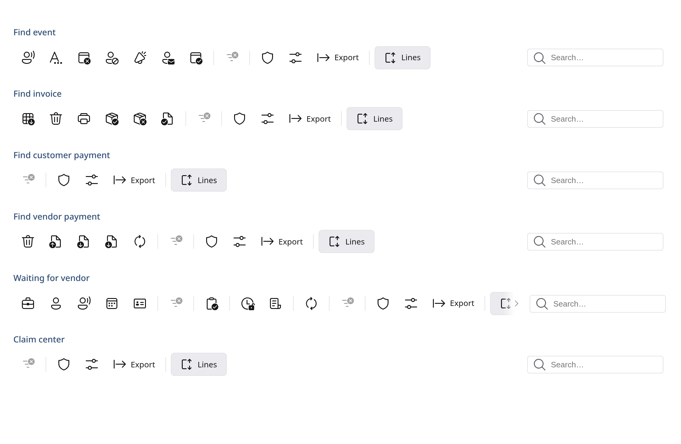
- Every icon reworked for accessibility
- A layout for each person
- A Help tab, rewritten from the ground up
- What to do differently
- Find event, Find invoice, Find customer payment, Find vendor payment, Waiting for vendor, Vendor directory, Claim center, Report center, Power tools
- Questions and answers
What is Flow UI?
Flow Platform is the software interpreting and language service companies use to schedule, bill and pay for their work. Flow UI is the design system behind it: one shared set of building blocks, the tables, lists, menus, messages, icons and forms, that every screen is made from. We describe it in full in Meet Flow UI.
Flow UI was built around one rule we call Terrascale: performance comes first. The screen should answer right away no matter how much information sits behind it. FlowGrid, the table you see in the pictures below, has been tested with 5,000,000 records, and the Advanced Dropdown, the list you use to pick accounts, with 1,000,000 accounts. It stays quick and does the searching and sorting instantly so the screen never freezes.
The nine modules at a glance
| Module | What it is for | Worth noticing |
|---|---|---|
| Find event | Look up scheduled events and act on them | A Cancel window that shows the dates, vendors and cost first |
| Find invoice | Find customer invoices and process them | Every change asks you to confirm first |
| Find customer payment | Find payments received from customers | Payment status columns and a Transaction ID search |
| Find vendor payment | Find payments made to vendors | Void several at once, and a Check date search |
| Waiting for vendor | See who still owes paperwork | New Ready for review action |
| Vendor directory | Find vendors by language, place or name | A map with a radius you can change |
| Claim center | See how a claim changed over time | Every saved copy of a claim, side by side |
| Report center | Run, build and share reports | Ready-made reports you can turn into your own |
| Power tools | Platform-wide changes for super administrators | A preview before any big change, and compliance exports |
One unified interface
Unified means all information is reached in the same way. Screens powered by the legacy platform sorted with a double-click, split results into pages and kept their columns in a settings tab, and each had grown small habits of its own. Now they share one way of working. Once you learn one screen, you already know the others.
Here is an example. A coordinator who spends the day in Find event opens Find invoice for the first time. The search box is at the right end of the toolbar, as usual. Right-clicking a row shows what can be done with that invoice, as usual. Export, the column controls and the row counts are all where they expect them. There is nothing new to learn, only the invoice to deal with.
Here is what works the same on all of them:
- One list you scroll. There are no pages. Every match is in one list, even when there are thousands.
- One click to sort. Click a column heading to sort, and click again to reverse.
- Filter from where you are. Right-click any value to keep only those rows or to hide them. More on this below.
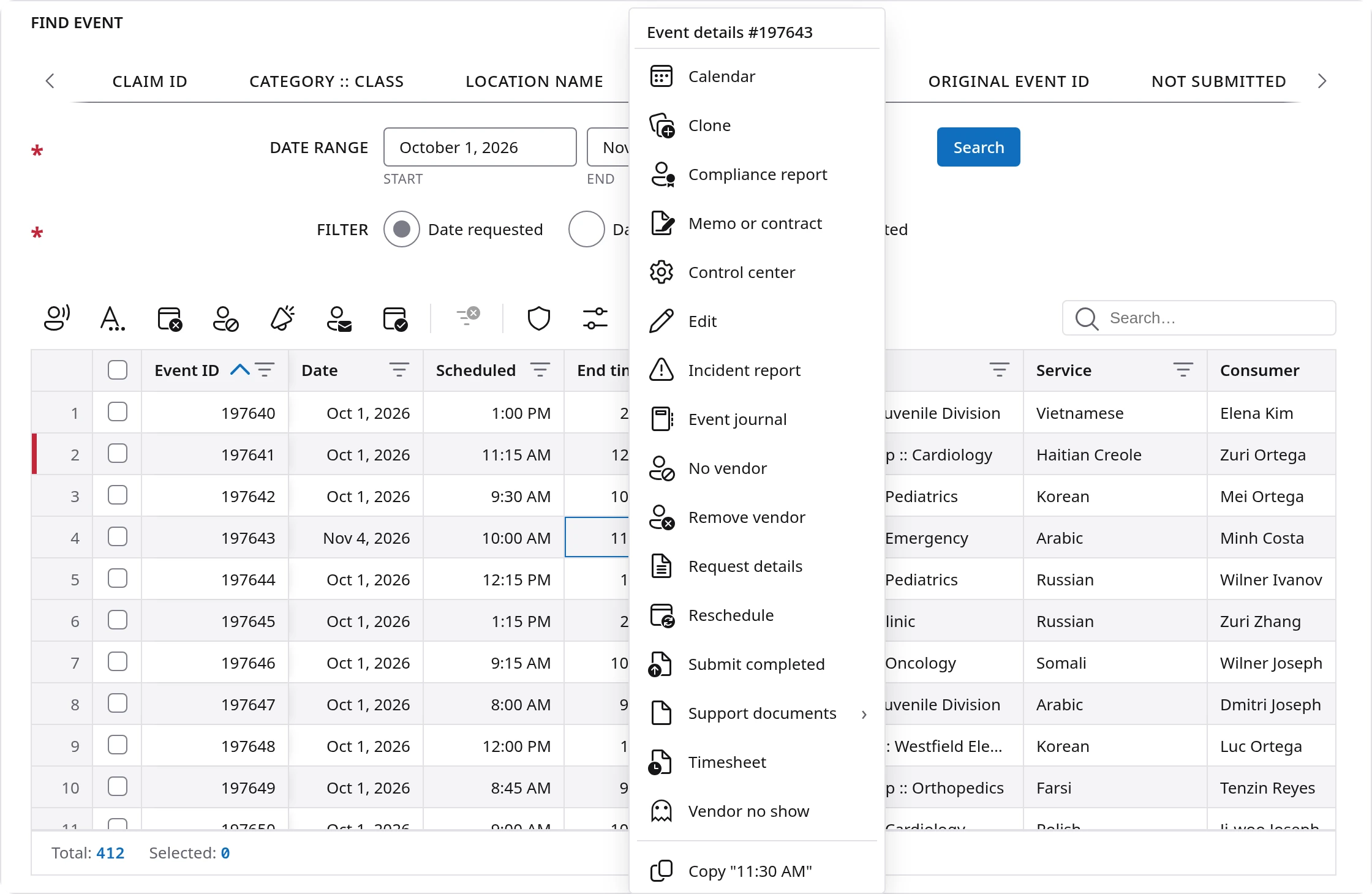
- Act from the row. Right-click a row for what you can do with it. Tick several rows to act on them together.
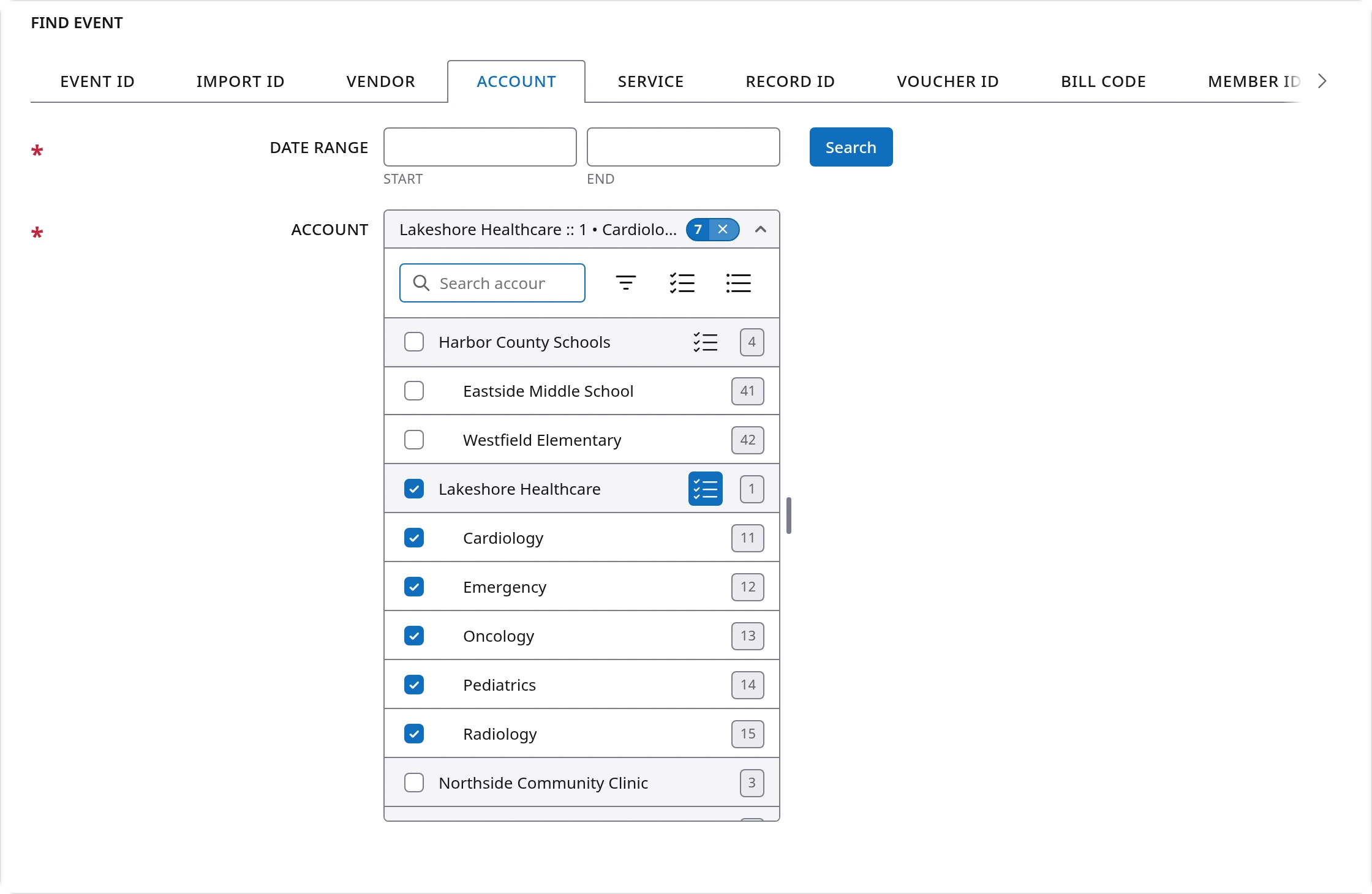
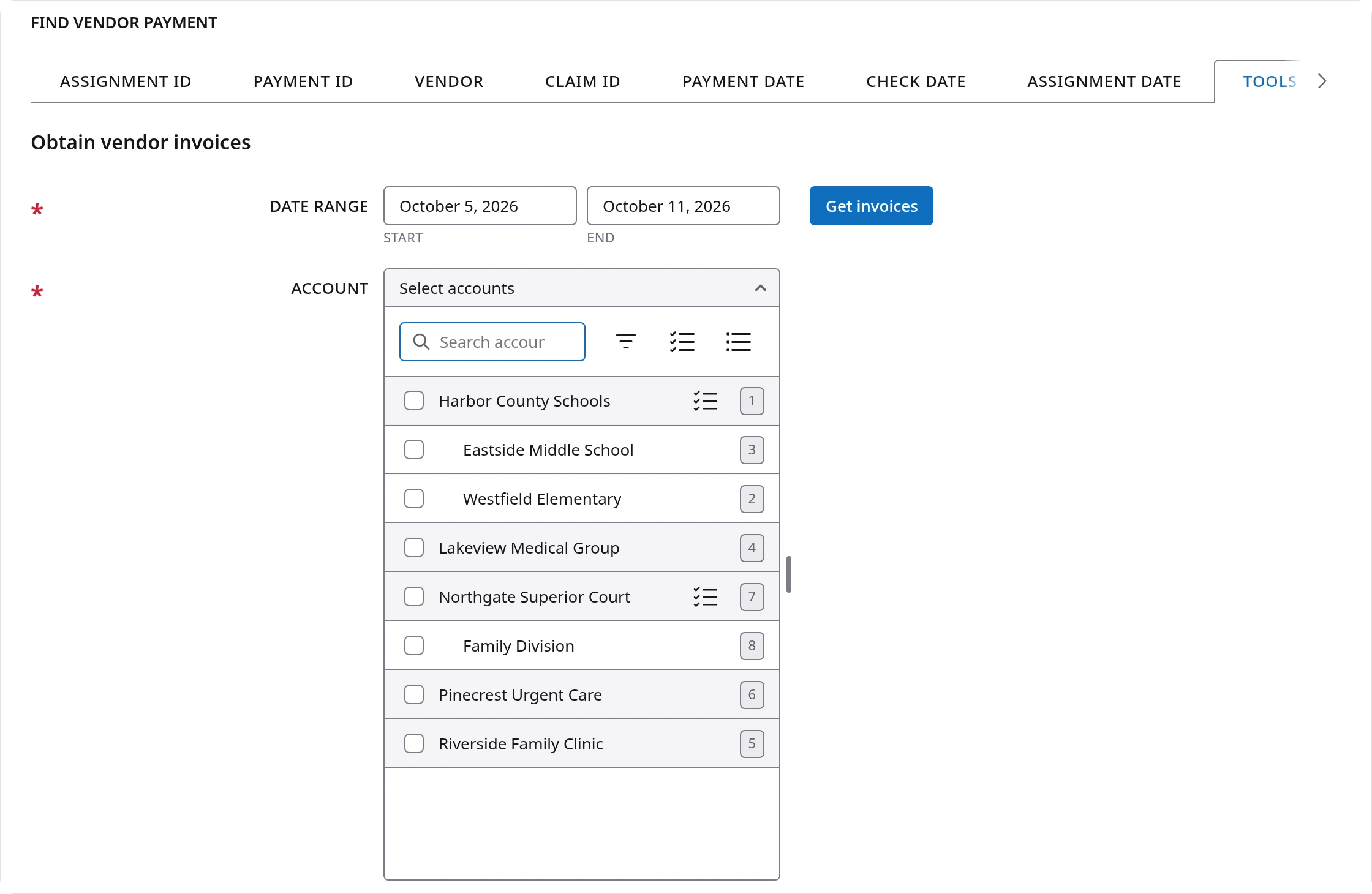
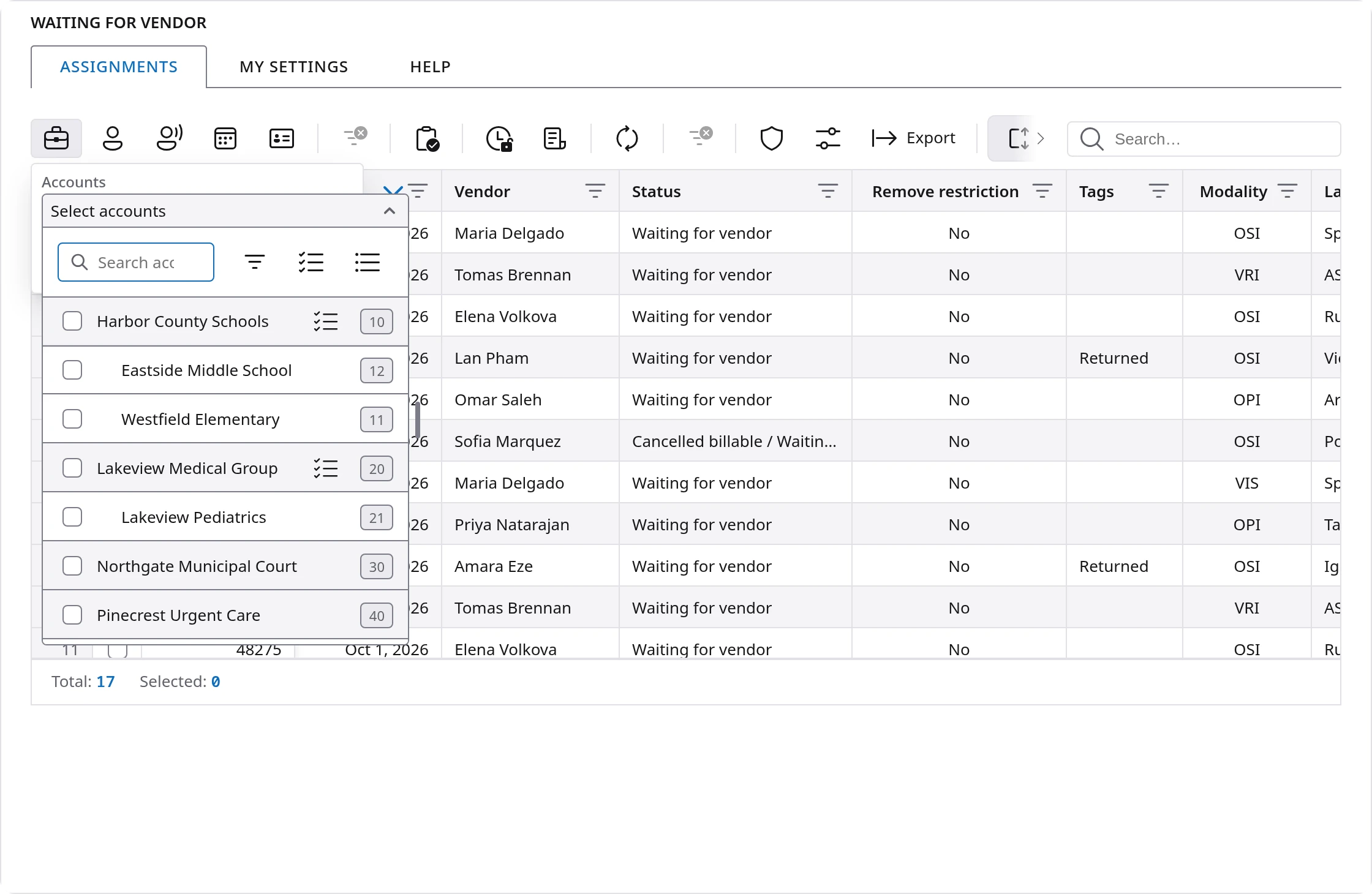
- Lists you can search. Every list of accounts, vendors or languages has a search box and stays open while you tick. One click on the small icon beside a main account picks it with all of its sub-accounts.
- Counts you can trust. The bar under each table says how many rows you found and how many you have ticked.
- Messages that look the same. Confirmations, warnings and errors appear in one consistent way, and a confirmation names exactly what is about to change.
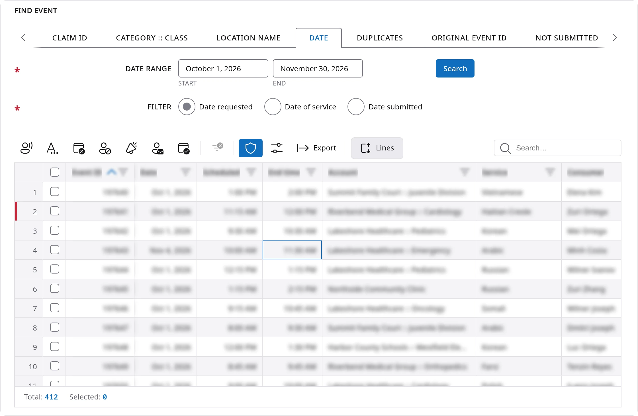
Two tools deserve a special mention, because they are on every table. Export saves what you are looking at as a CSV, Excel or PDF file, with your logo if you want it. Privacy mode, the shield on the toolbar, blurs the names and numbers on the screen so you can share your screen on a call without showing a customer's information.
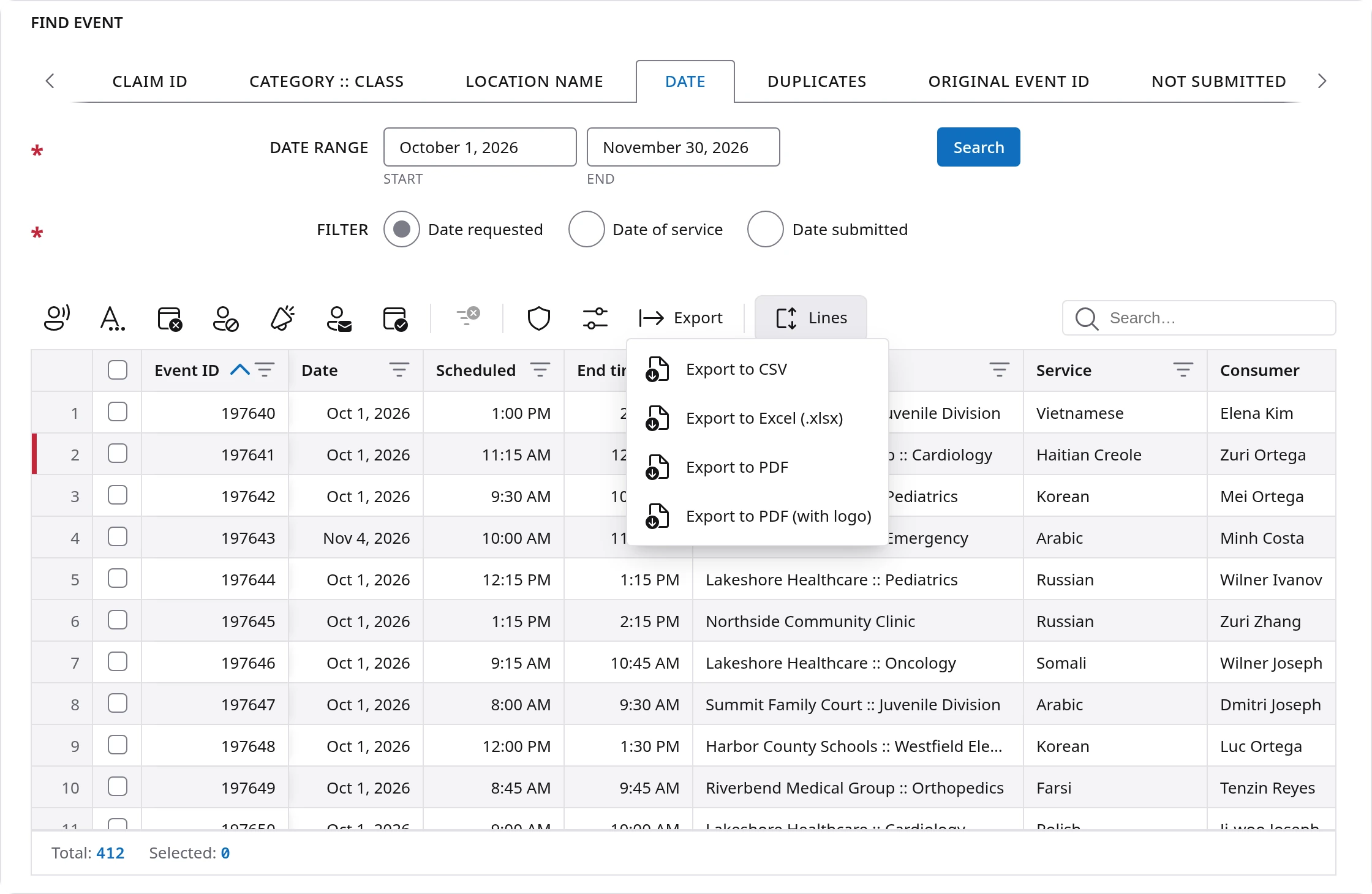
Multiple filters: from thousands of records to a few lines
Most of the time you are not looking for one record by its number. You are looking for "that Pediatrics visit, not the Vietnamese one, from around the 17th." FlowGrid is built for exactly that. You can stack filters across as many columns as you like with nothing but right-clicks, and cut thousands of records down to a few lines without typing anything or filling in a filter form.
It works in three moves:
- Filter by. Right-click any value and choose Filter by to keep only the rows with that value.
- Exclude. Right-click any value and choose Exclude to hide the rows with that value.
- Repeat on the next column. Each filter works on what the last one left. They act at once, with no window to fill in and no button to press.
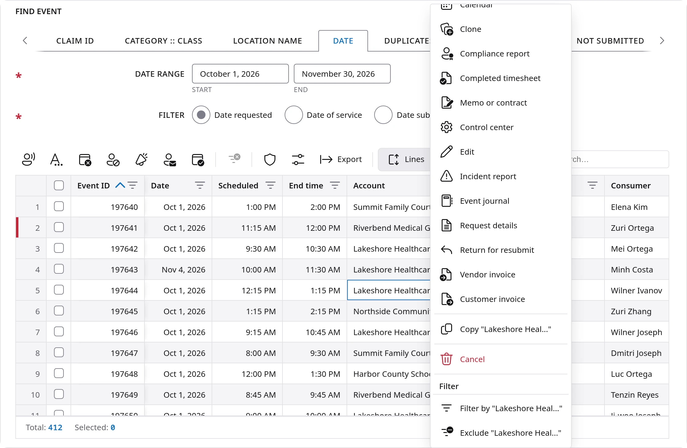
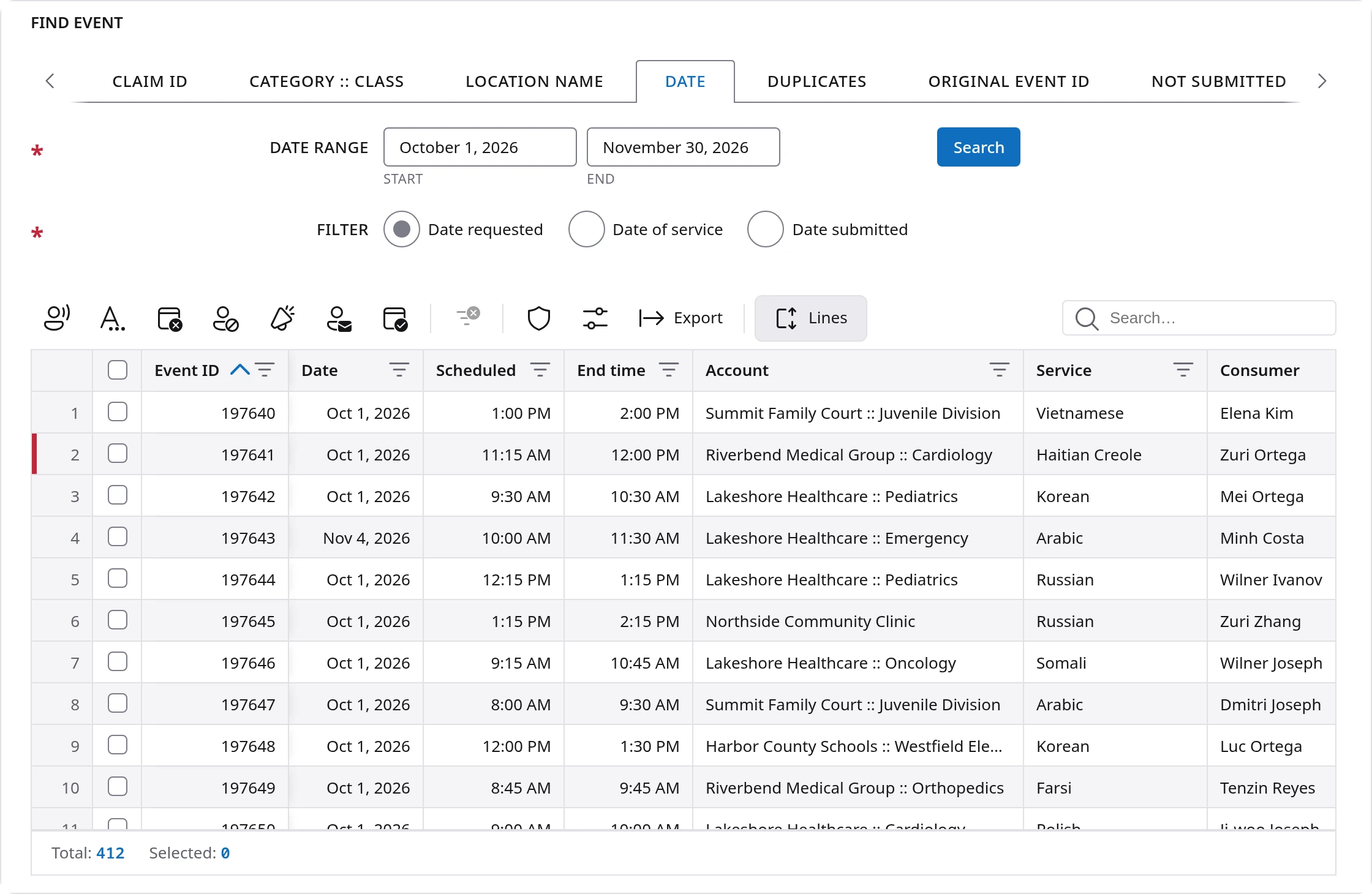
Here is a real example from the picture below, using sample data. A date search finds 412 events:
- Right-click Lakeshore Healthcare :: Pediatrics in the Account column and choose Filter by. 412 rows become 20.
- Right-click Vietnamese in the Service column and choose Exclude. 20 rows become 17.
- Right-click Oct 17, 2026 in the Date column and choose Filter by. 17 rows become 1. That is the event you were looking for.
That took three right-clicks, and the same moves work just as well on a list of many thousands.
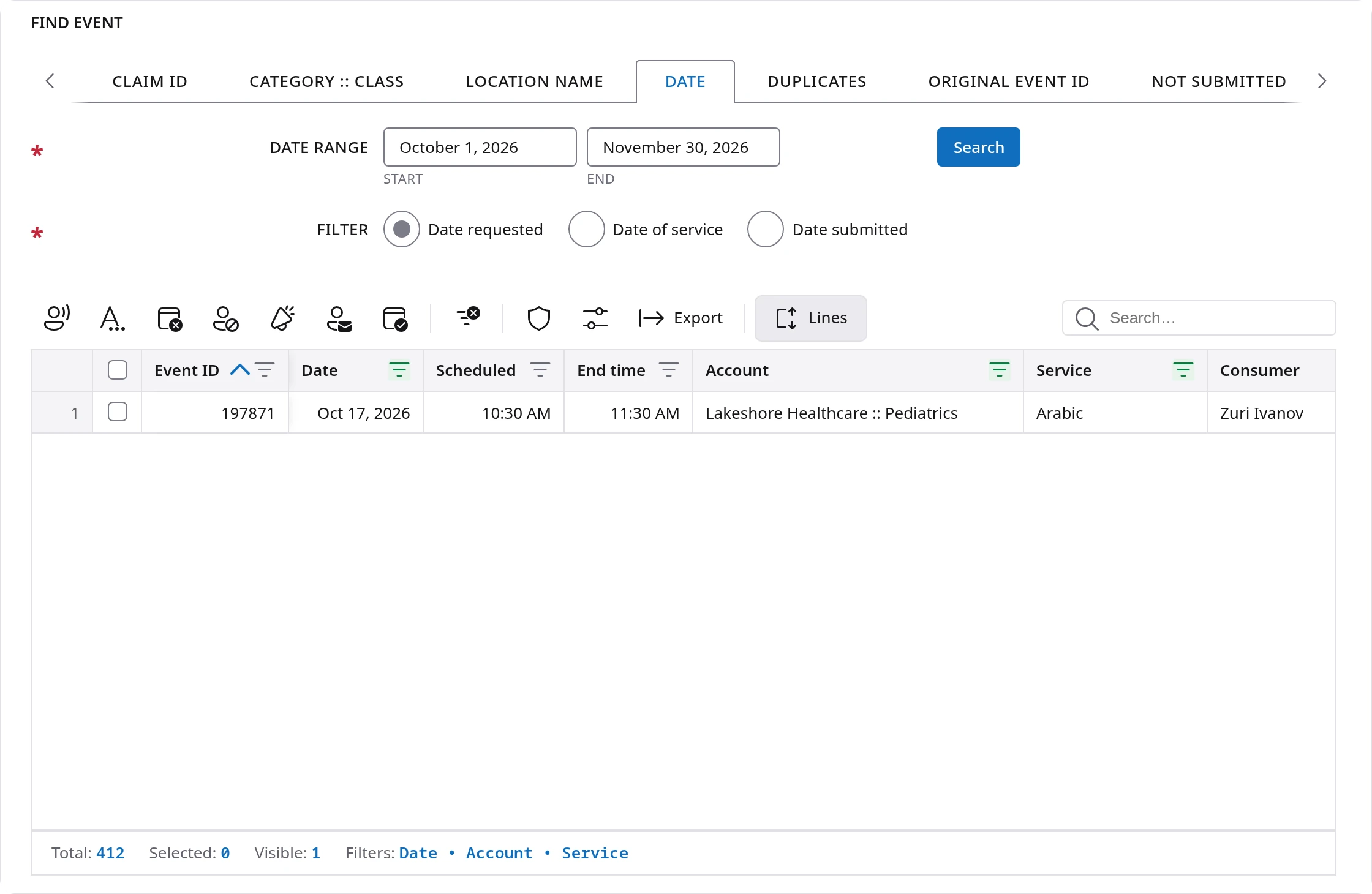
You can always see what is filtered, so you are never left wondering why a record seems to be missing. The bar under the table keeps the count for you: Total is how many records your search found, Visible is how many are left, and Filters names every column you have filtered, for example Date, Account and Service. The funnel in each filtered column's heading turns green as well.
One click brings everything back. Clear all filters, on the toolbar, removes every filter at once and instantly restores the entire table. It leaves your sort and your columns as they were, so you can narrow the list one way, finish that job, clear it, and narrow it another way without running the search again.
When you need more than one value, the funnel in a column heading opens a small filter box. There you can pick a test such as Contains or Is equal to, or tick several dates or amounts from a list.
Every icon reworked for accessibility
People use Flow Platform in many different ways. Some cannot use a mouse, some have low vision, some cannot tell certain colors apart, and many spend eight hours a day looking at the screen. WCAG 2.2 AA is the international standard for making websites work for all of them. WCAG stands for Web Content Accessibility Guidelines. Level AA is the level most organizations are asked to meet.
A table full of small icons is exactly where screens often fall short of that standard, so we reworked every icon in the platform, more than 250 of them. In plain terms:
- One drawing style. Every icon is drawn on the same grid with the same line weight, so none looks heavier or fainter than the one beside it.
- Larger and easier to see. Icons now sit in a 24 pixel box, large enough to see at a glance and to click without aiming carefully.
- Enough contrast. Icons, buttons and the edges of boxes are checked against their background, in light mode and in dark mode.
- A name for every button. Rest the pointer on an icon and it tells you what it does. The same name is there for people using a screen reader, which is software that reads the screen aloud.
- Icons that say what they mean. Reschedule is a calendar with circular arrows. Timesheet is a page with a clock. The picture should explain the button before you have to ask.

Accessibility is built into the shared parts of Flow UI, not added to each screen afterward. When we find a problem in a shared part, we fix it once and every screen gets the fix. Twelve of the fifteen findings in our Power tools audit were fixed this way. We test each module against the standard: an automated checker on every state of the screen in both light and dark mode, then a walk through the page with only the keyboard, then measured contrast, zooming and text spacing. In its latest check of Power tools, the automated checker found no problems in any of its 20 screen states, in either mode.
For a customer, this has a practical side as well. Courts, hospitals and public agencies are often asked to show that the software they use meets accessibility standards like this one, and the interpreters and staff who use it every day benefit from it directly.
A layout for each person
A scheduler, a billing clerk and an owner can look at the same list and care about completely different columns. So these modules let each person set up the screen for the way they work. Your choices are saved for you only. They do not change what anyone else sees, and they are waiting for you the next time you sign in.
For example, a billing clerk in Find invoice can keep Status, Total and Balance near the left and hide the rest, while the coordinator at the next desk keeps the claim and assignment columns. They share the same invoices and each sees them in the way that makes sense for their own job.
- Manage columns. Choose which columns show and in what order, right above the table. There is no Save button; it remembers on its own.
- Move and size columns. Drag a column to move it, drag its edge to resize it, or right-click its heading to fit it to its content or hide it.
- Row height. The Lines control shows 1, 2, 3 or 4 lines per row, so long notes can be read in the table.
- My settings. Most modules have their own: hide the search tabs you never use, choose how the list sorts when it opens, and turn on what suits your job, such as hiding cancelled events.
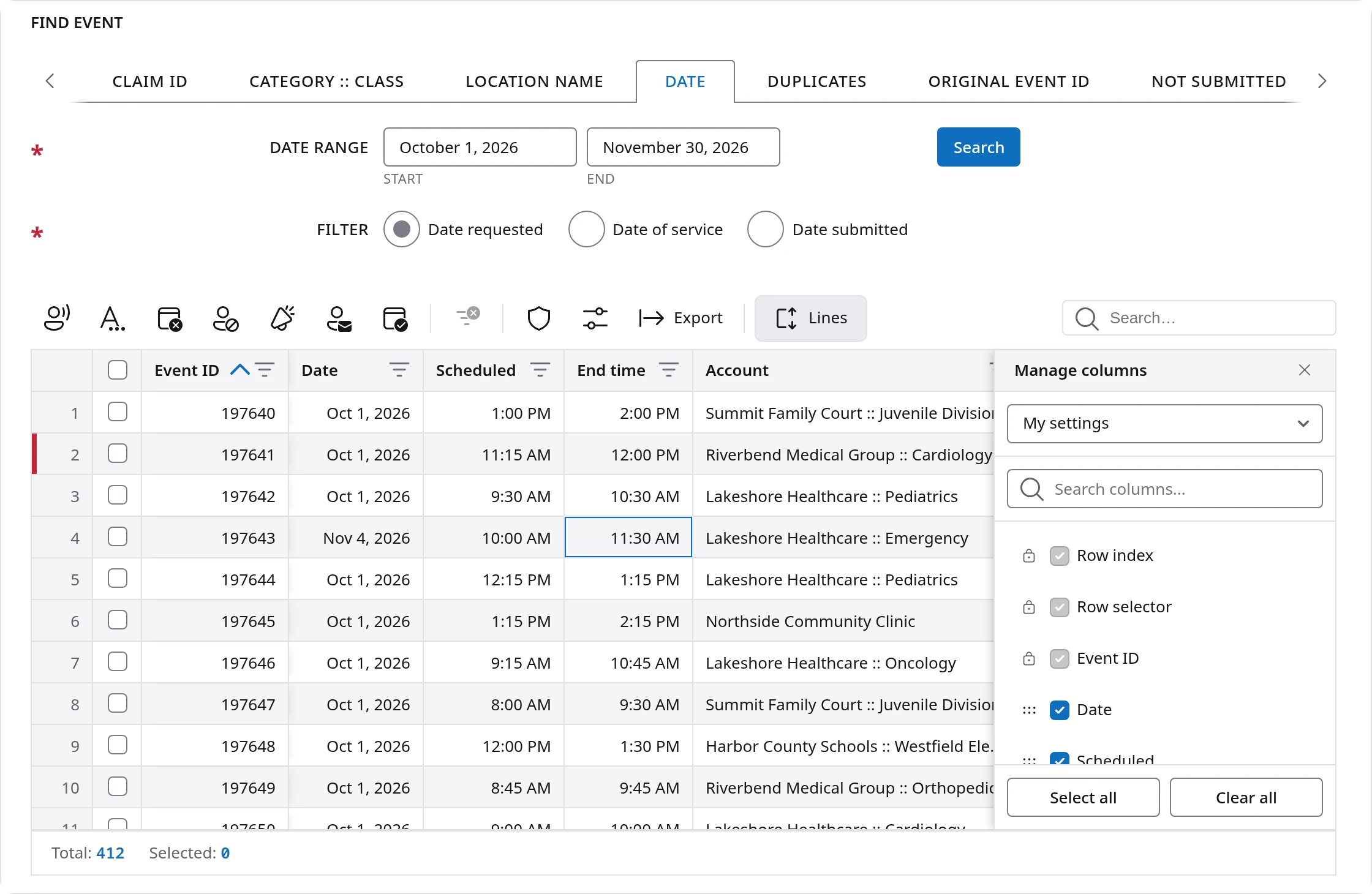
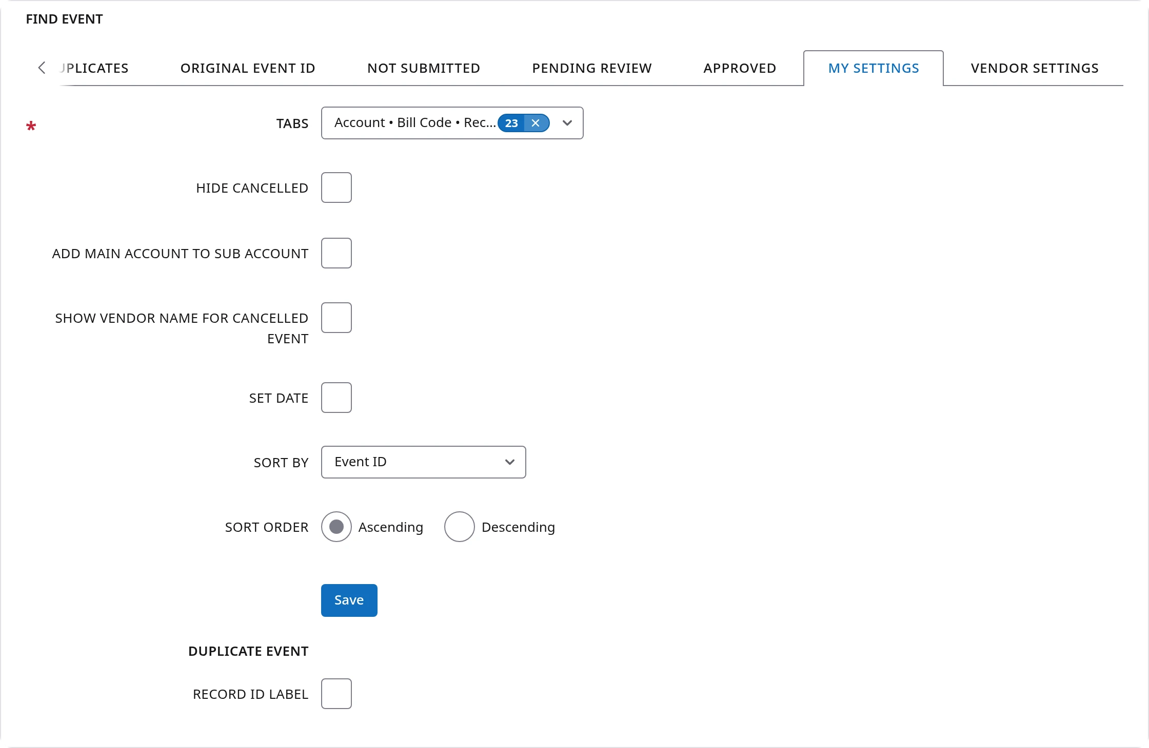
This is how the platform adapts to your company without anyone having to change it for you. Each person takes a few minutes once, and then the screen fits their job.
A Help tab, rewritten from the ground up
Each module comes with its own Help tab. Click it and the manual for that module opens right there on the screen, so you can read a step and do it without leaving the page or losing your place. You only see the manual written for your role, whether you are staff, a vendor or a customer.
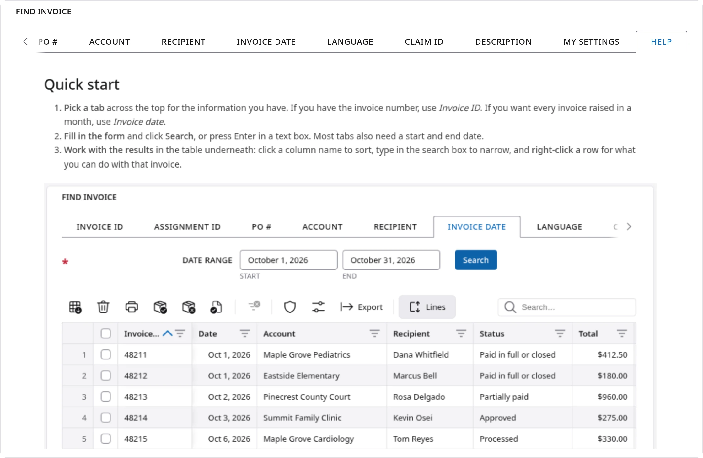
We rewrote these manuals from the ground up, because a manual only helps if the person reading it, often in a hurry, can use it. Each one now:
- Starts with a quick start, the few steps most people came for.
- Says what changed, where a screen has moved, in a table of what you used to do and what to do now.
- Shows the control it names. When a step says to click something, a picture of that part of the screen sits beside the step.
- Uses plain words and short sentences, and the exact labels you see on your screen.
- Ends with what to do when something looks wrong, listing what you might see, what it means and how to fix it.
- Follows your light or dark mode, pictures included.
What to do differently
If you have used these screens for a long time, a few old habits need to change. Everything else works the way you remember.
| What you used to do | What to do now |
|---|---|
| Double-click a column heading to sort | Click it once. Click again to reverse the order. |
| Choose your columns under My settings | Use Manage columns on the toolbar. It saves by itself. |
| Hold Ctrl to keep a list open | Nothing to hold. The list stays open until you click away. |
| Hold Alt on a main account to take its sub-accounts | Click the small icon beside the main account. |
| Set the number of records per page | There are no pages. Every match is in one list. |
| Use Quick search to filter the screen | Use the search box at the right end of the toolbar. |
| Choose Show this payment only | Right-click the payment number and choose Filter by. |
Find event
What it is for: looking up an event that has already been scheduled. You pick a tab for what you know, such as an event number, a customer, a date range or a claim, fill in the short form, and the matching events appear in the table.
Find event is where many people spend their day, so it gained the most. There is a toolbar of actions for all the rows you tick, filtering straight from a cell, and a check for duplicate events with matching rules you set yourself. The right-click menu holds everything you can do with one event, in one place.
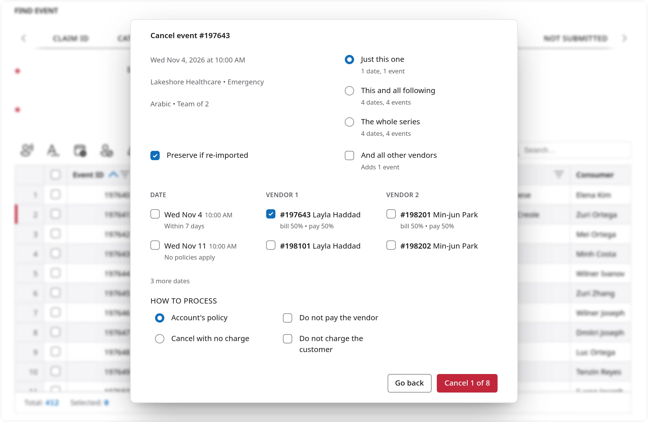
The new Cancel window deserves its own mention. Say a hospital cancels one visit in a weekly series that has two interpreters. Before you confirm, the window shows the dates, each vendor, and what each cancellation would mean, for example bill 50% and pay 50% under your policy. You choose just this one, this and all following, or the whole series. You can also cancel with no charge, or choose not to pay the vendor or not to charge the customer. Nothing happens until you confirm, and the button says exactly how many events it will cancel.
Find invoice
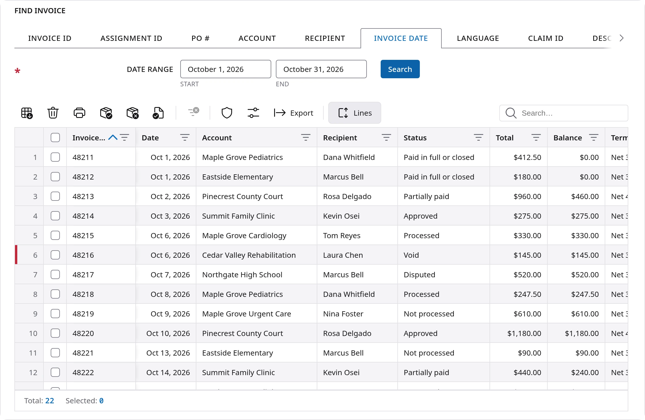
What it is for: finding customer invoices by invoice number, date, recipient, account, language, claim and more, then viewing, processing, exporting or voiding them.
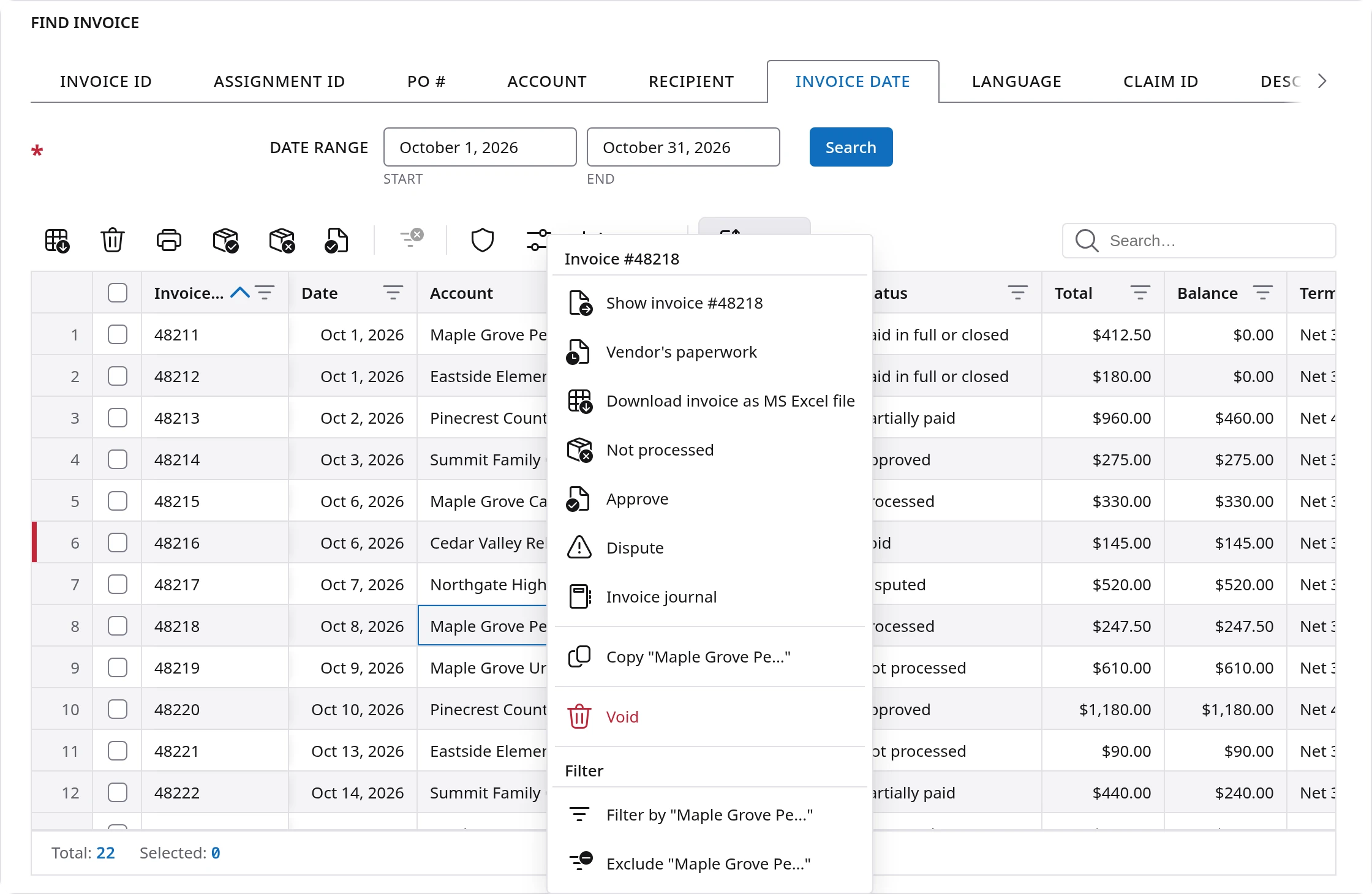
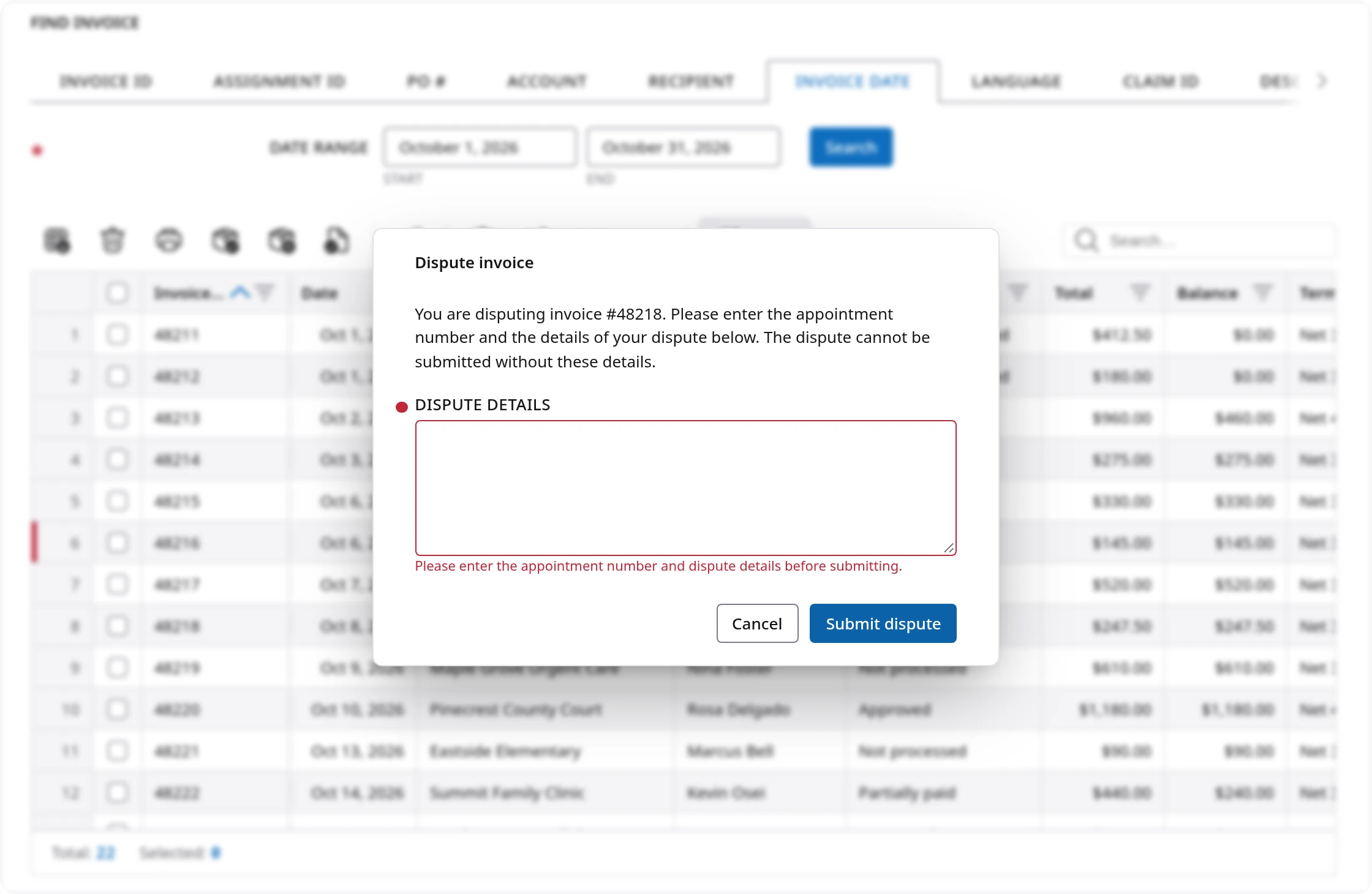
The main change is safety. Every action that changes an invoice now asks you to confirm first, in a small panel that names the invoice. You can also approve, dispute and reopen invoices from the row menu, and mark many at once as processed by ticking them.
For example, when a customer questions a charge, right-click the invoice and choose Dispute. The panel asks for the details and will not submit without them, so the reason is on record for whoever picks it up next.
Find customer payment
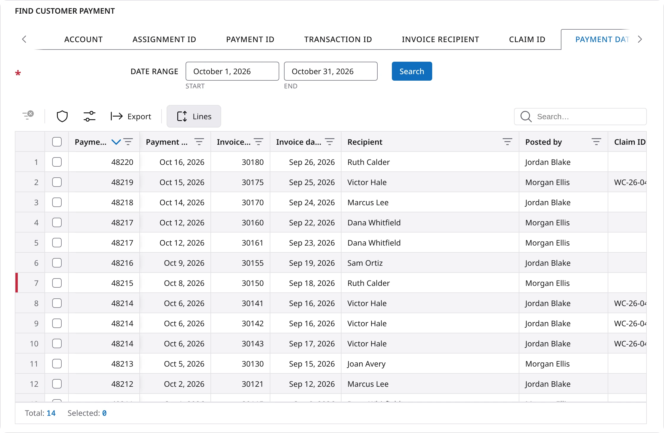
What it is for: finding payments you have received from customers, by invoice, account, assignment, payment number, transaction ID, recipient, claim or payment date.
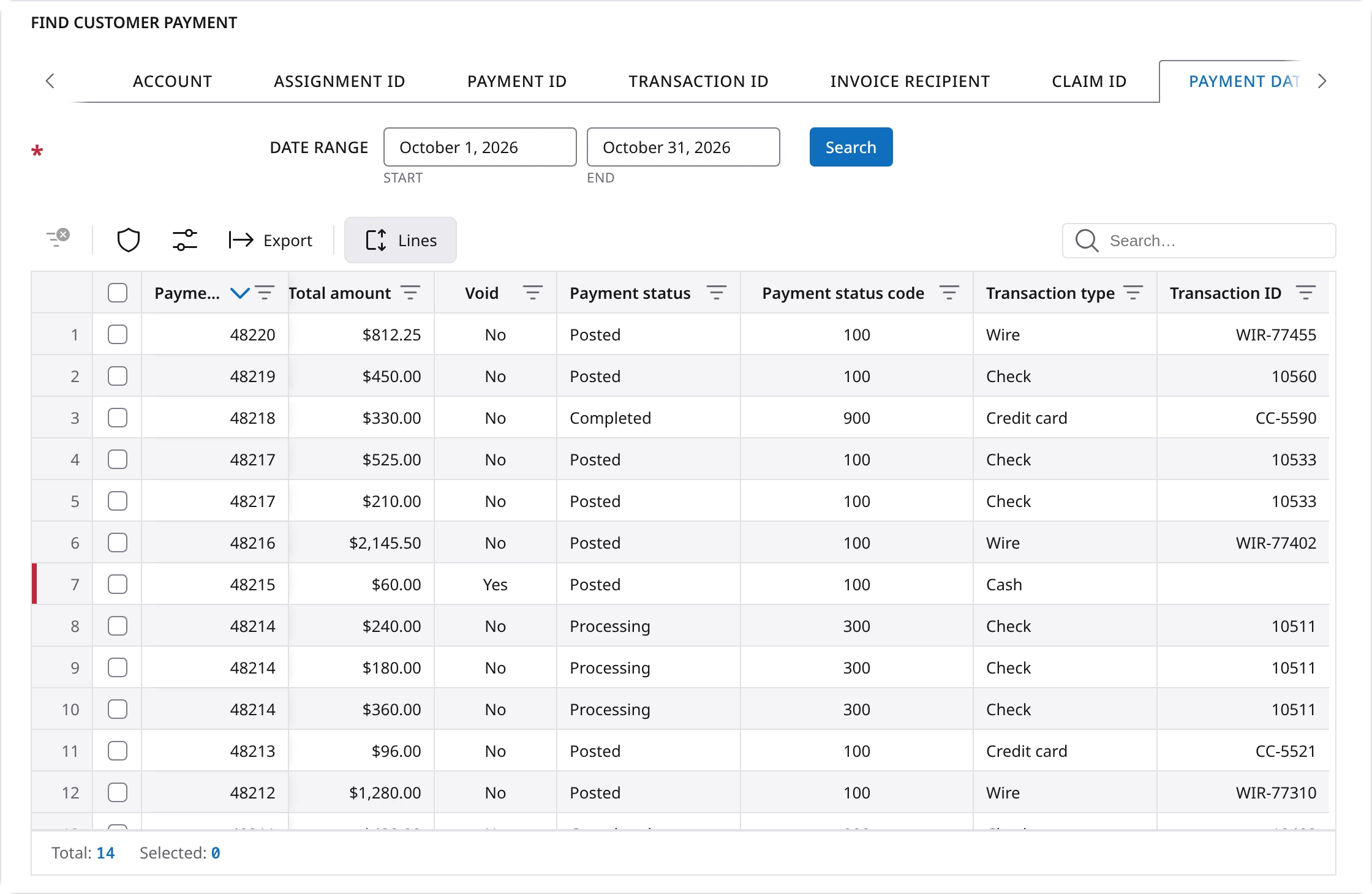
Each payment is listed with the invoices it paid, one row per invoice, so you can see where the money went. New Payment status columns show what happened to a payment after it was recorded, and the Transaction ID tab lets you start from the reference number on a bank statement.
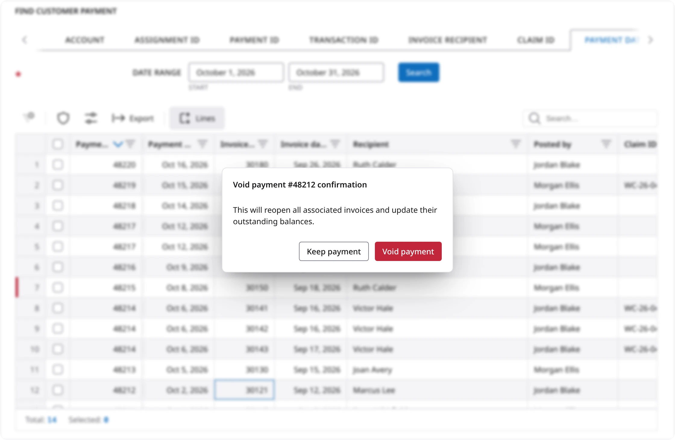
If a check bounces, you can void the payment from the row menu. Before it goes through, the screen tells you that the invoices will reopen and their balances will update, so nobody is surprised afterward. If only one invoice was paid by mistake, you can take that invoice off the payment and leave the rest alone.
Find vendor payment
What it is for: finding payments you have made to vendors, by assignment, payment number, vendor, claim, payment date, check date or assignment date. A vendor is the interpreter or agency you pay.
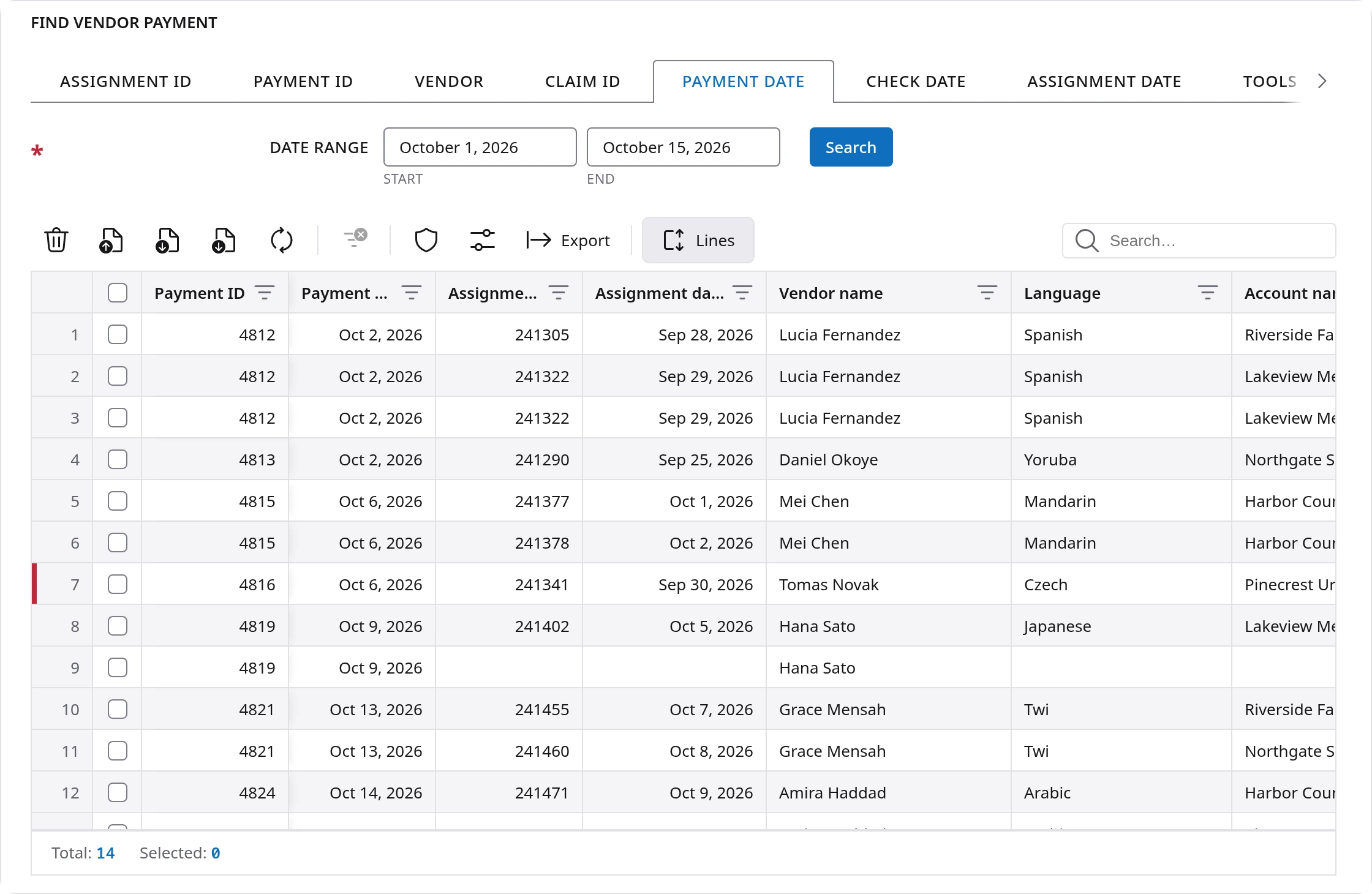
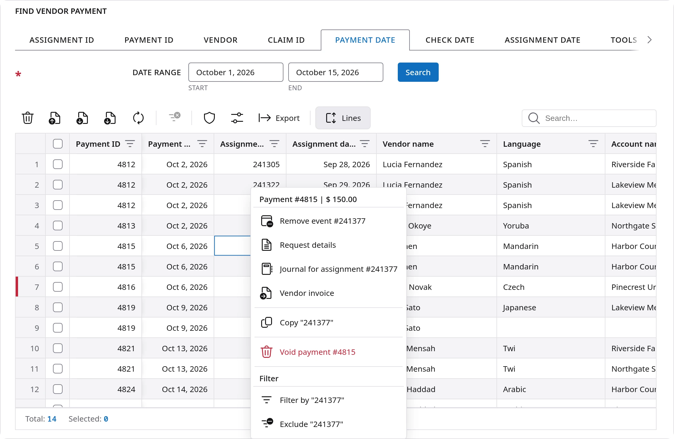
When an interpreter calls about a check, you can now search by the check date. You can void several payments at once, and any that were already void are skipped for you. You can also take one assignment off a payment, or open the assignment, its journal or the vendor invoice from the row menu.
The Tools tab emails you copies of the vendor invoices for the accounts you pick and a date range of up to one week, which saves opening them one at a time. A setting under My settings shows payments for a zero amount if your company wants to see those too.
Waiting for vendor
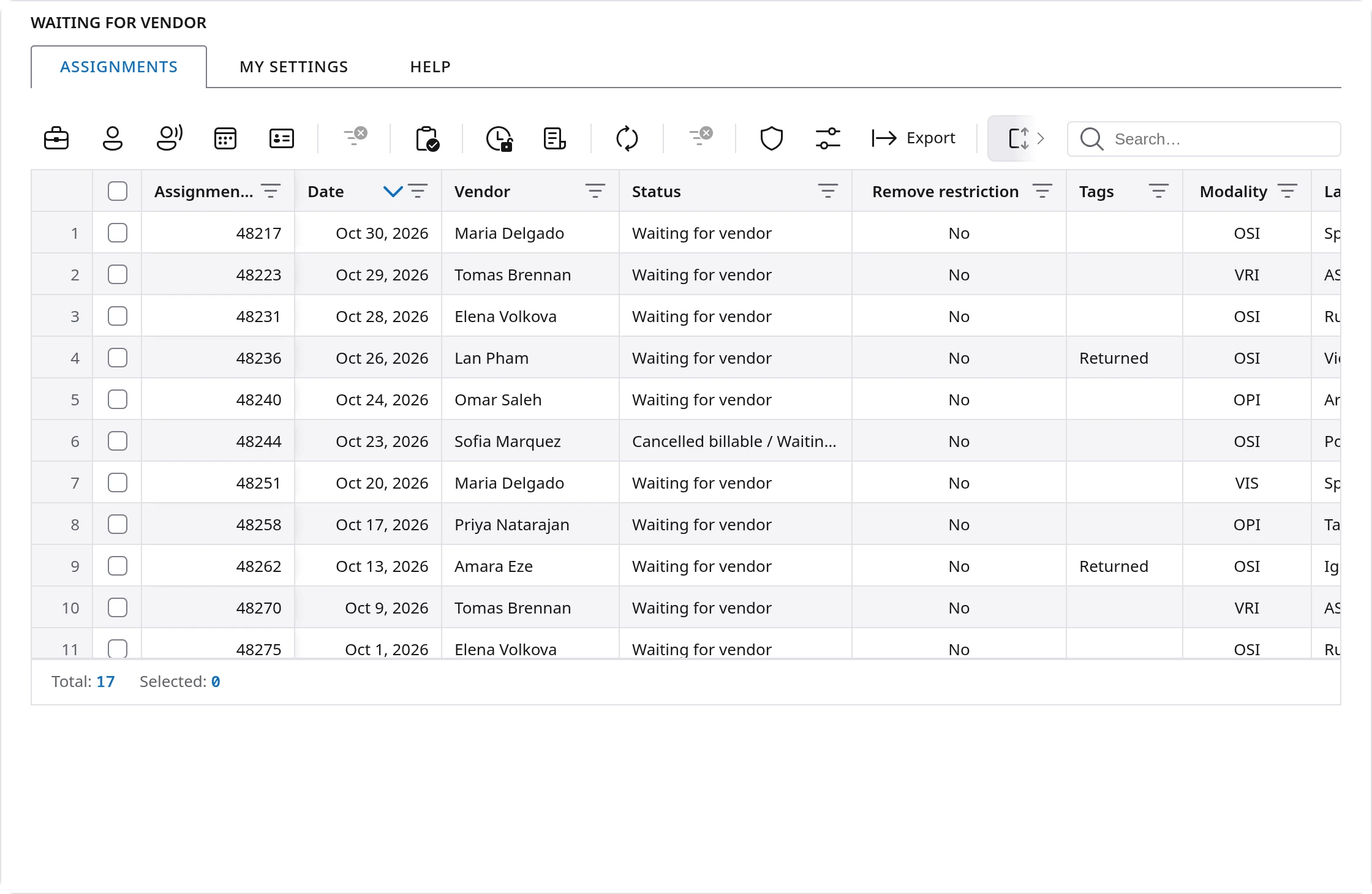
What it is for: seeing every assignment that took place in the past and is still waiting for its vendor, because the vendor did not use On the Spot! and did not submit the paperwork by hand.
The many separate buttons are now one tidy row of filters: Accounts, Vendors, Modality, Date and Tax form. Modality means how the work was done, such as in person, by phone or by video. One button clears them all.
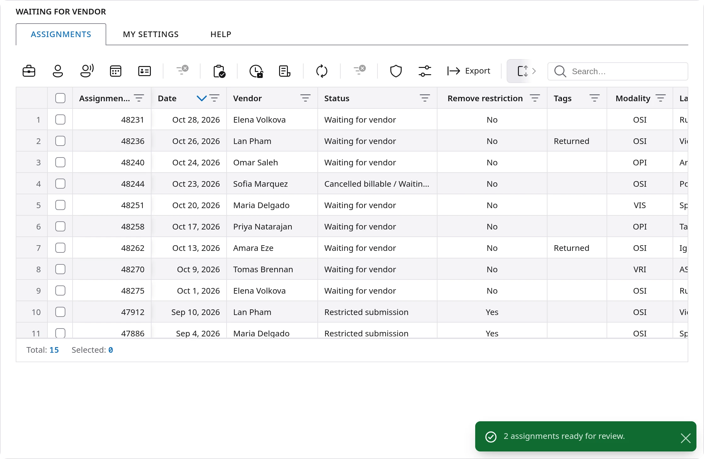
The most useful change is new. Ready for review moves assignments on yourself, from the toolbar or the right-click menu. Before, an assignment could only leave this list when the vendor submitted or through Accrued expense. So if an interpreter has given you their paperwork some other way, you can move the assignment forward without waiting. You can also lift a late submit restriction from here, and a new setting shows only W-2 vendors or only 1099-MISC vendors.
Vendor directory
What it is for: finding the right vendor. You can search by language, zip code, city and state, country of origin, compliance profile, name, phone number or branch. A compliance profile is a set of required documents and checks, such as the ones for court or medical work.
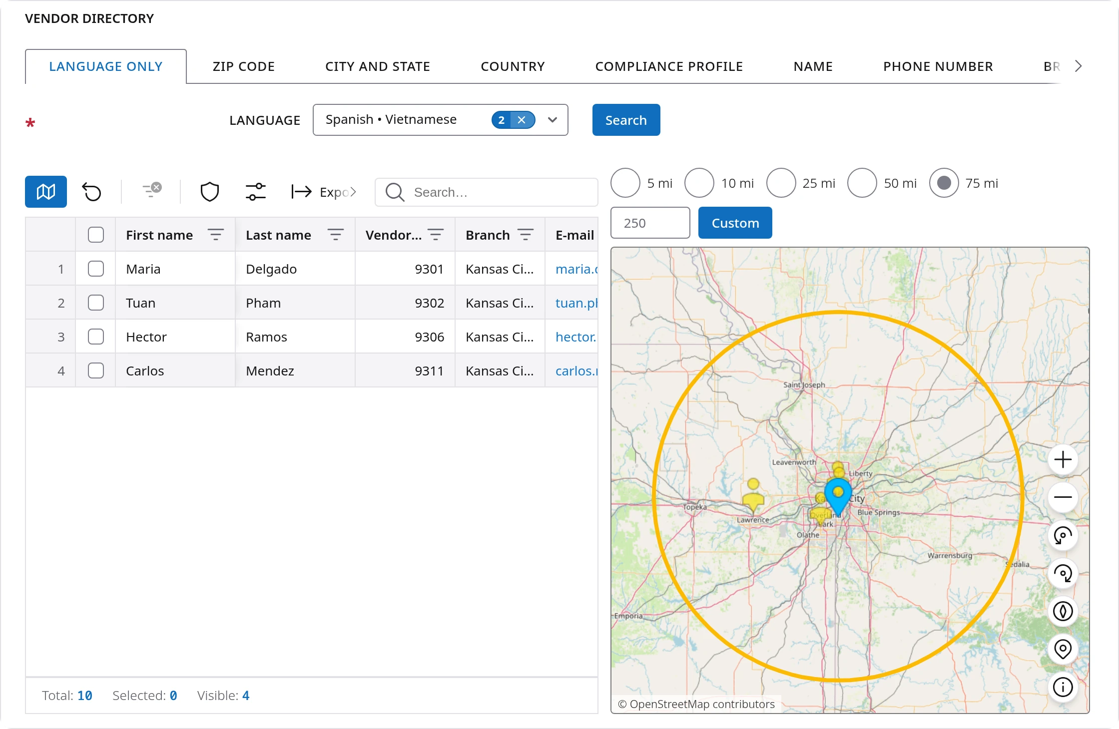
The table and a map sit side by side. Say you need someone who speaks Vietnamese near a clinic in Kansas City. On the Language only tab, pick the language and the map draws a ring around you. Choose 5, 10, 25, 50 or 75 miles, type your own distance, or drag the center pin to the clinic. The table keeps only the vendors inside the ring.
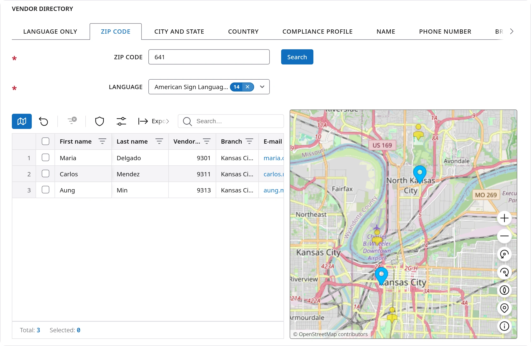
On the other tabs, pins mark each place the search found. Click a pin to keep only the vendors there. Click a vendor on the map for their phone, email and languages, ready to copy.
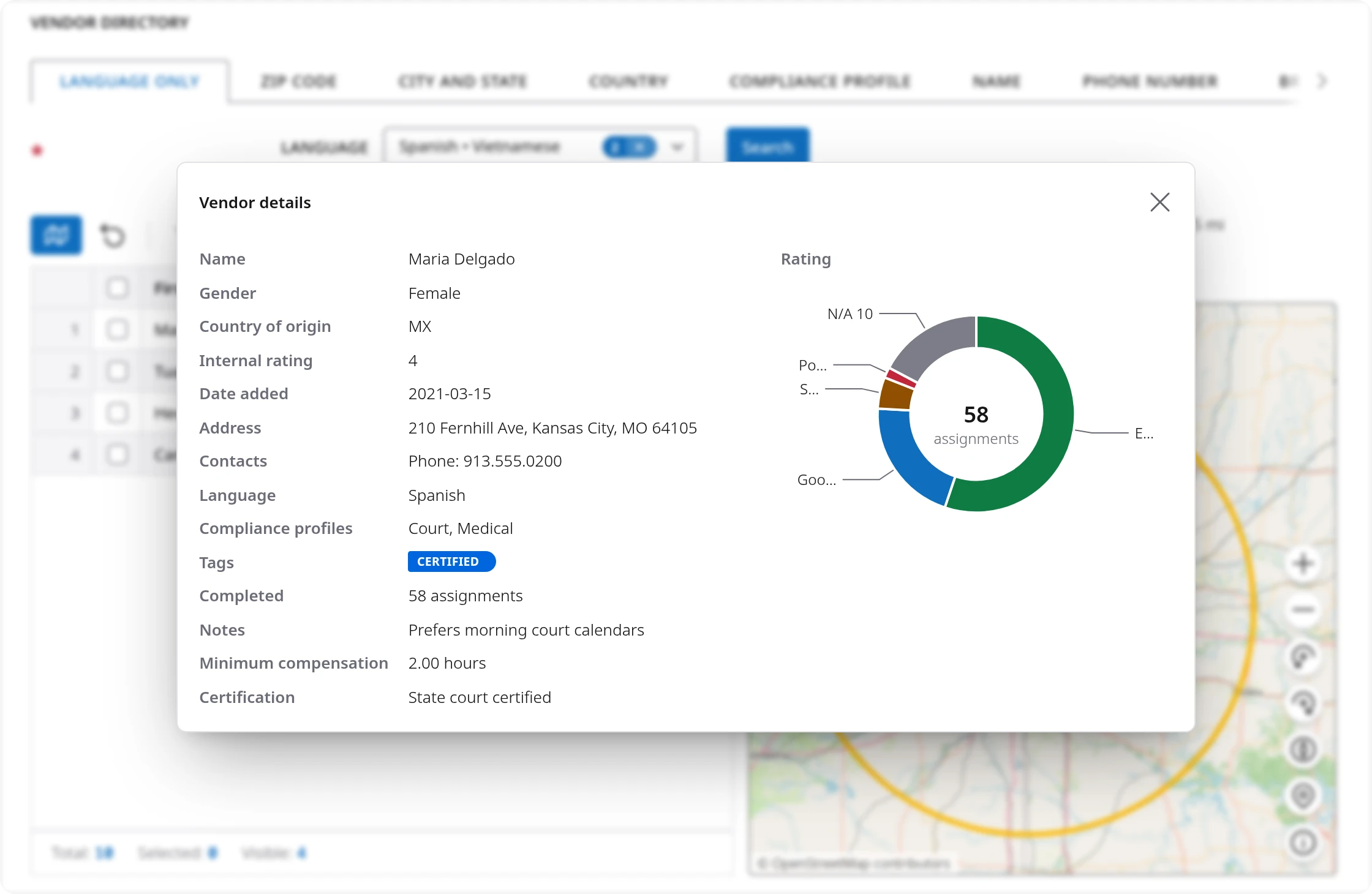
Right-click a vendor to open their details card: address, contacts, languages, compliance profiles, tags, notes, how many assignments they have completed, and a chart of their ratings. Their full compliance report is one more click away.
Claim center
What it is for: seeing what the platform holds about one claim, and how it changed. A claim is the insurance or workers compensation case an interpreting job is billed against.
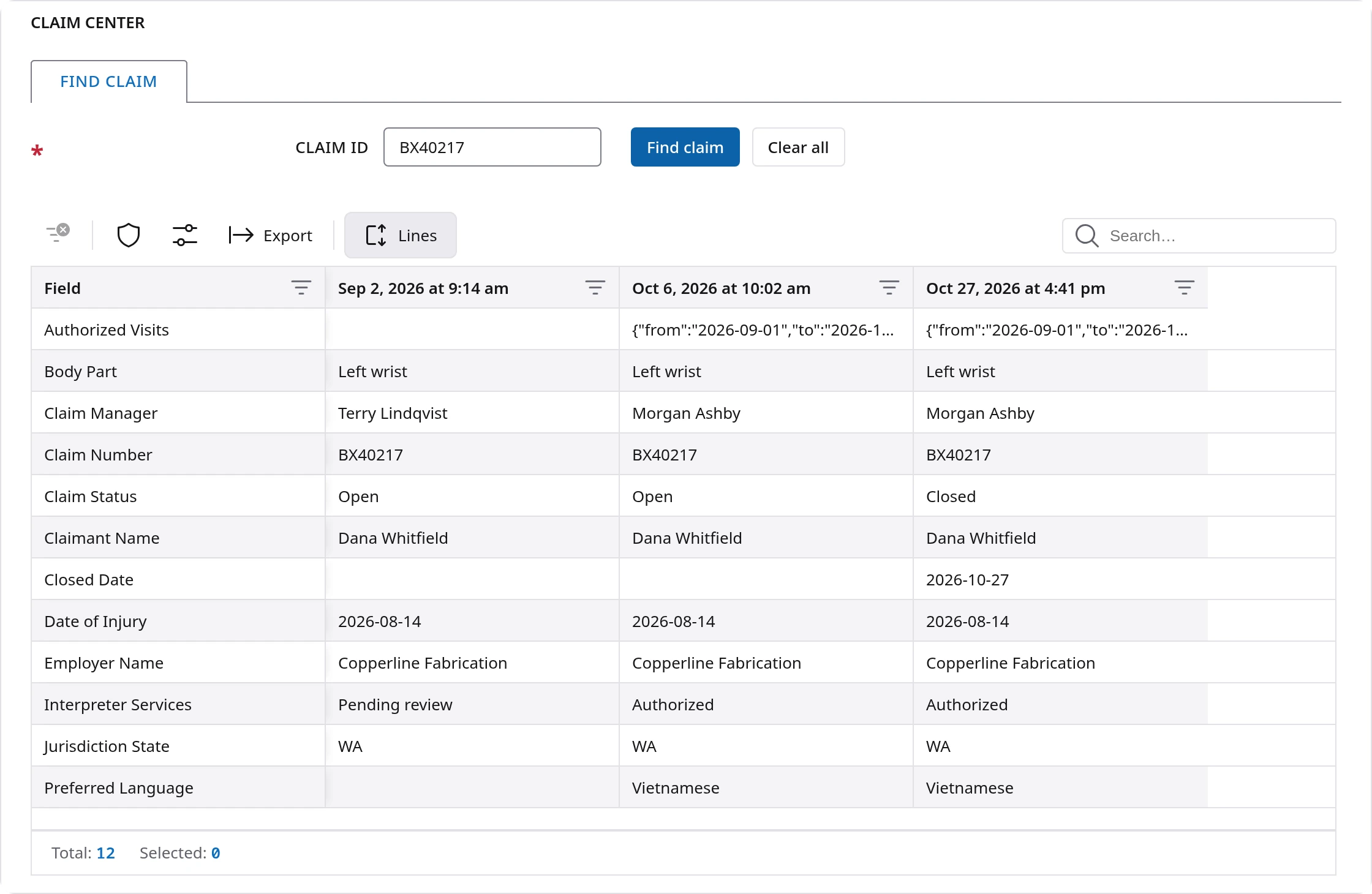
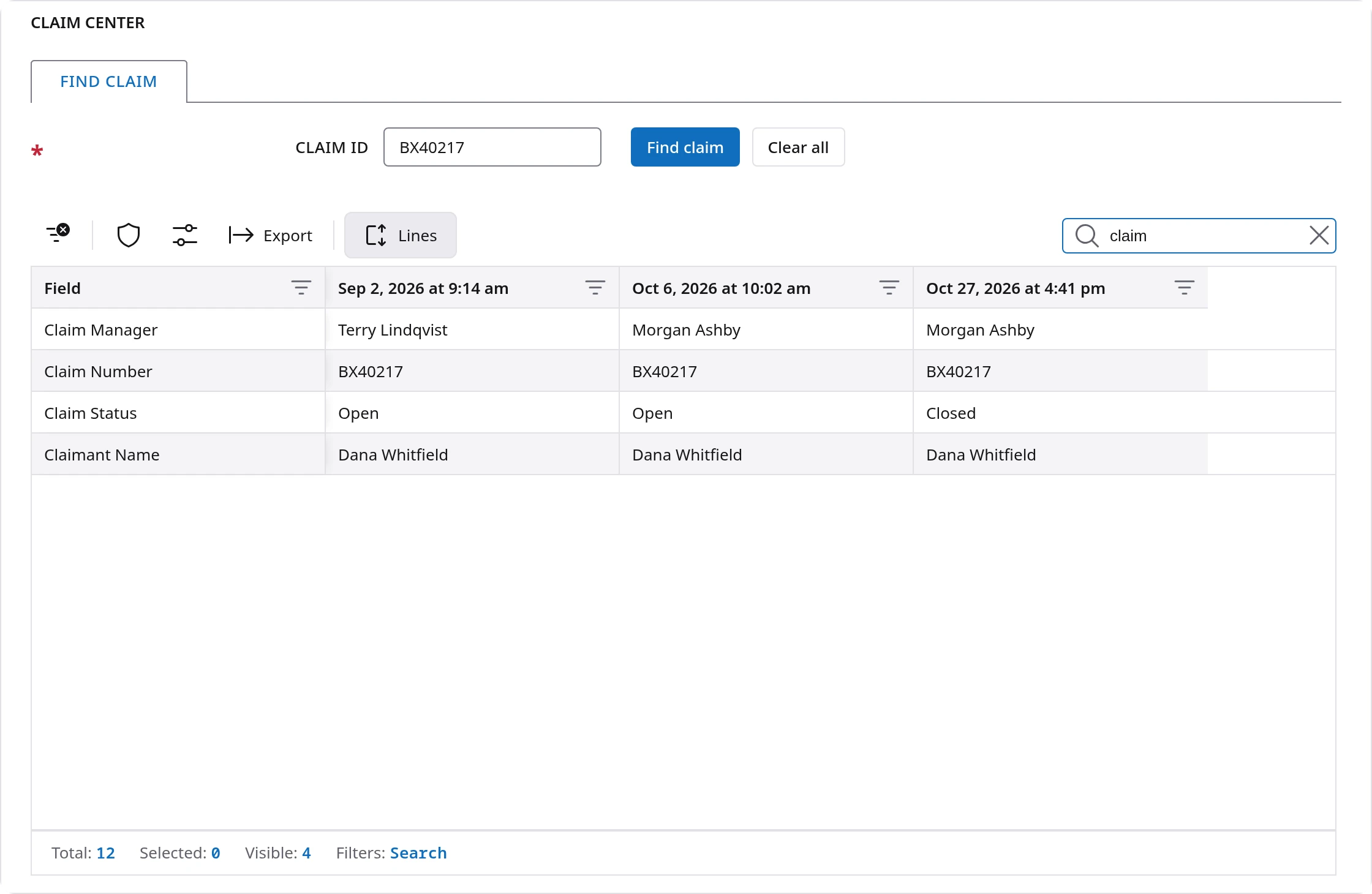
Type the claim ID. Every saved copy of that claim appears in one table: a row for each piece of information, such as the claimant, the employer and the status, and a column for each copy, oldest on the left and newest on the right. Read across a row to see what changed and when.
For example, if an adjuster asks when a claim closed or who managed it in September, you can answer in seconds. Claim center only reads, so nothing you do on this screen can change a claim, an assignment or an invoice.
Report center
What it is for: running reports, building your own and sharing them. It can be limited by branch, account, service or category, depending on your access.
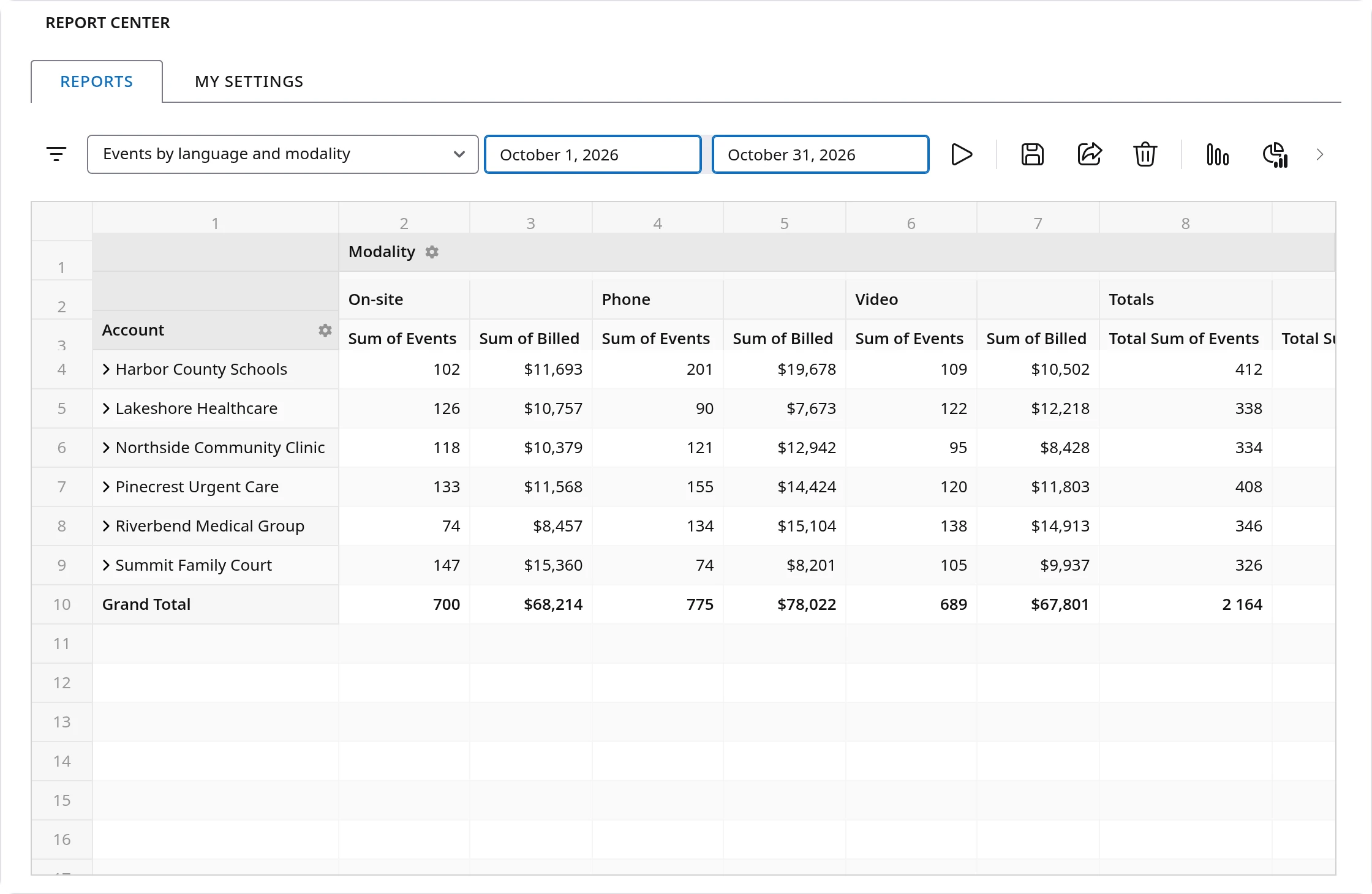
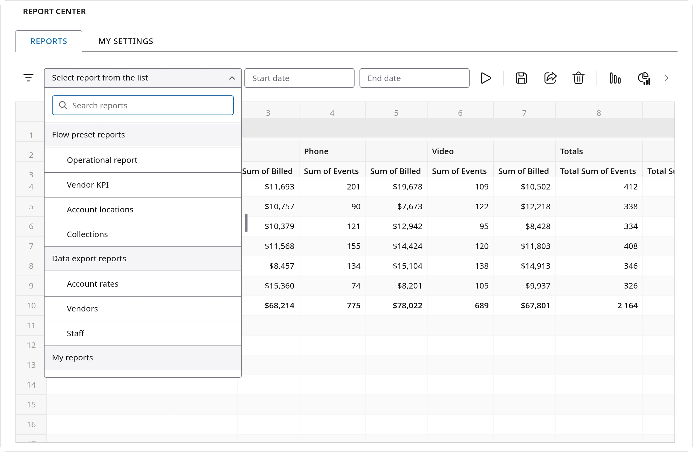
Start from a ready-made report, or from a data export for accounts, vendors, staff, users or payroll. Pick your dates and run it. Then shape it into what you need: choose fields, change their order, add totals, or switch to a chart. Save it under My reports and it is there next month. Share it with a colleague or a customer and it appears under their Shared reports.
For example, an owner can take a preset report, group it by account and language, add up events and billing, and save it as a monthly report that is one click away from then on.
Power tools
What it is for: the changes that affect the whole platform, and the fixes no other screen can make. It is for super administrators only.
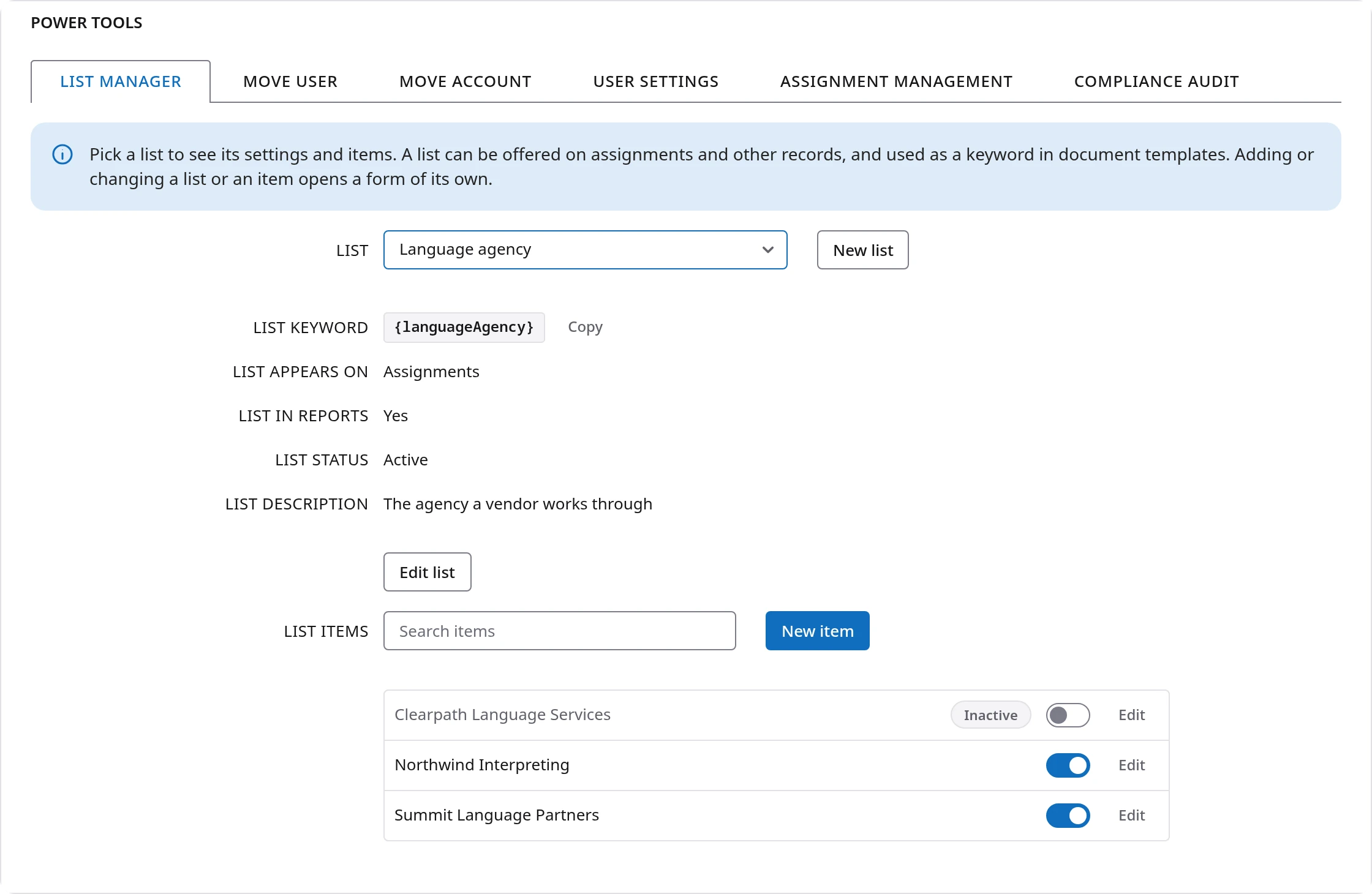
Every tab opens with a short blue note saying what it does and what it changes. The tools include:
- List manager, for the lists people pick from on events, such as a language agency or a court division.
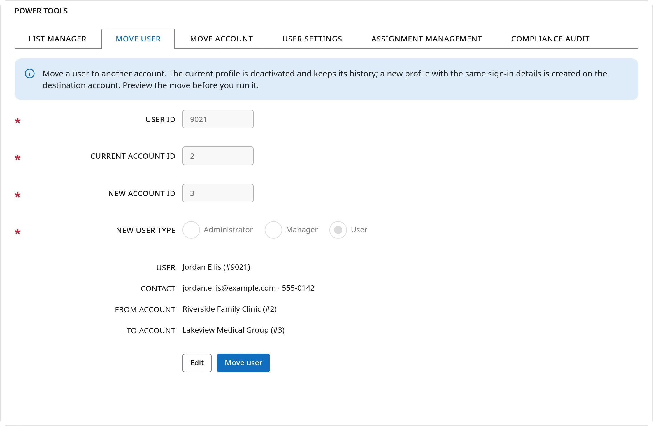
- Move user and Move account, which show exactly what will change and ask you to confirm before anything moves.
- User settings, for choices that apply across groups of users, such as vendor analytics.
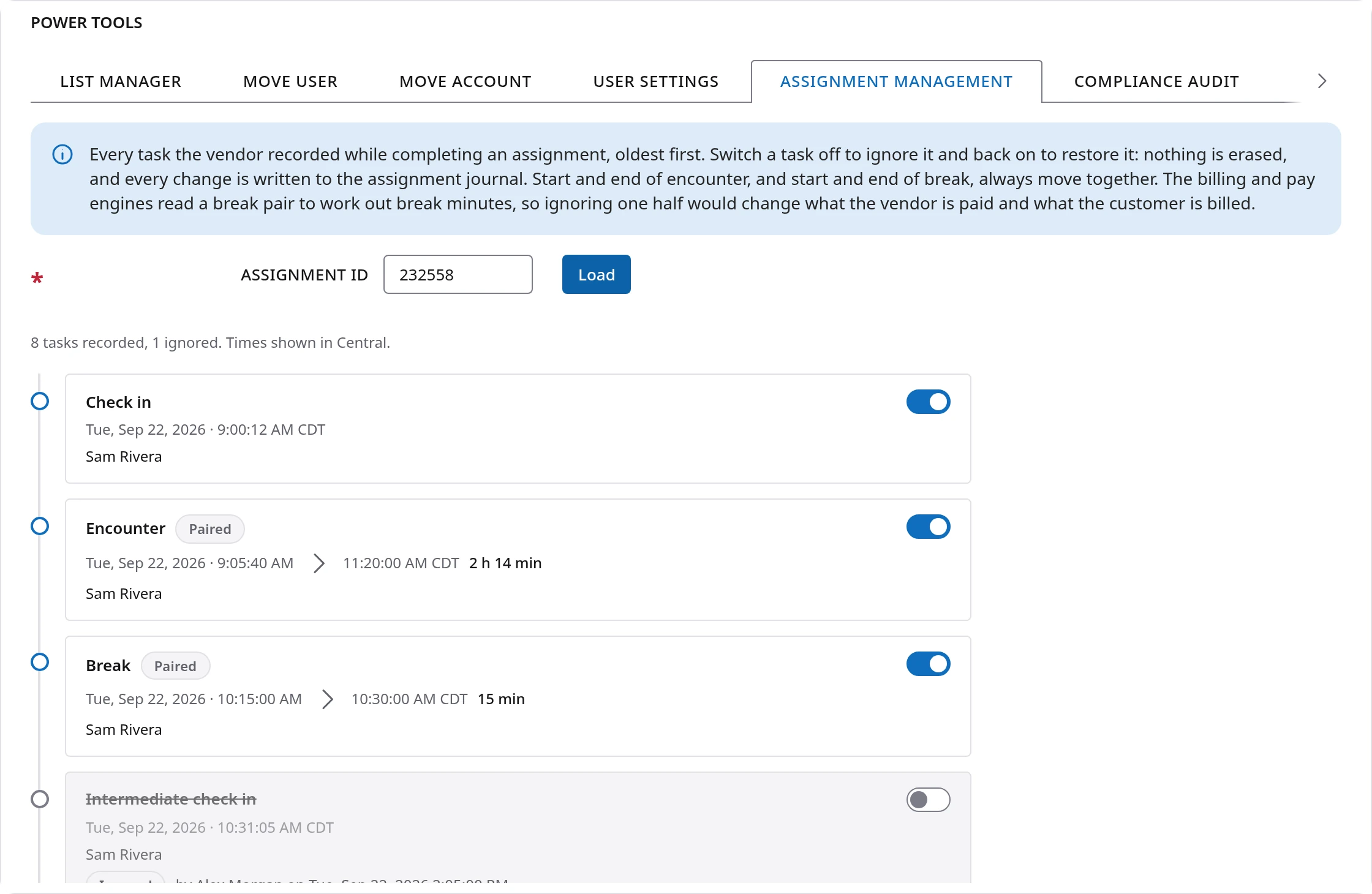
- Assignment management, which lists every step a vendor recorded on an assignment. If a break was started twice by mistake, you can switch that entry off. Nothing is erased, and the change is written in the journal.
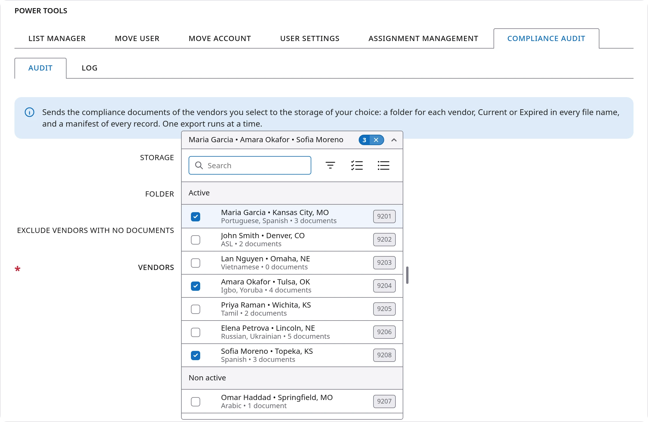
- Compliance audit, which sends your vendors' compliance documents to your own OneDrive or SharePoint, SFTP, S3 or WebDAV storage, one folder per vendor, with Current or Expired in each file name. When an auditor asks for your records, you can have them organized and delivered without collecting them by hand.
Questions and answers
What is Flow UI?
Flow UI is the design system behind Flow Platform, the software interpreting and language service companies use to schedule, bill and pay for their work. It is one shared set of tables, menus, lists, messages, icons and forms that every screen is built from, so every screen works the same way.
Which Flow Platform modules now run on Flow UI?
Find event, Find invoice, Find customer payment, Find vendor payment, Waiting for vendor, Vendor directory, Claim center, Report center and Power tools all run on Flow UI.
What does a unified interface mean?
It means all information is reached in the same way. The toolbar, the search box, the right-click menu, the column controls and the counts under each table sit in the same place and behave the same on every screen. What you learn on one screen works on all of them.
How do I filter a long list quickly in Flow Platform?
Right-click any value in the table and choose Filter by to keep those rows or Exclude to hide them, then repeat on other columns. Each filter works on what the last one left, so a few right-clicks can take thousands of records down to a few lines. The bar under the table shows how many rows are visible and names every filtered column, and Clear all filters on the toolbar instantly restores the entire table.
Is Flow Platform accessible under WCAG 2.2 AA?
Flow UI is built and tested against WCAG 2.2 Level AA, the international standard for making websites usable by people with disabilities. That covers keyboard use, visible focus, color contrast, target size and text spacing, in both light and dark mode. Every icon in the platform was reworked as part of this effort.
Can each person arrange a screen their own way?
Yes. Each person chooses which columns show, their order and width, how tall the rows are, how the list sorts and which tabs appear. Those choices are saved for that person only and do not change what anyone else sees.
Where do I find help for a module?
Each module has its own Help tab that opens that module's manual right on the screen, so you can read the steps without losing your place. The manuals were rewritten from the ground up to explain what each module does, in plain language and with pictures of each control. You can also open a ticket at the Help Desk.
Did the search tabs or my data change in the move?
No. Your records are the same and the search tabs work the way they always did. What changed is how the results look and behave: one list you scroll, a toolbar above it, and actions on the right-click menu.
Questions about any of these screens? Open the Help tab on the screen, or visit our Help Desk and our team will be glad to assist.