Meet Flow UI: Instant at Any Scale, Built for Everyone
Flow UI is the new foundation of Flow Platform: one design system, built performance first, that stays instant with millions of records, works the same on every screen, and is accessible by design.

This week, Power Tools and the rebuilt Receive Payment became the first screens built entirely on Flow UI, the new foundation of Flow Platform, and the lists in Find Event already run on its grid. This article explains what Flow UI is, what it changes for you, and why it is the biggest upgrade to how Flow Platform looks and works since the platform began.
In short, Flow UI is Flow Platform's own design system: one set of building blocks, the tables, dropdowns, menus, notifications, tooltips, calendars, and forms, built once, built to a high standard, and used on every screen. Build something well once, and every screen that uses it gets the benefit.
Terrascale: performance comes first
Flow UI was designed around one rule we call Terrascale: performance is the number one objective. No matter how much data you have, the screen in front of you should respond instantly. A small agency and a statewide court system should have the same experience.
That rule was tested, not just stated:
- FlowGrid, the table behind our lists, has been tested with 5,000,000 records.
- The Advanced Dropdown, the selector you use to pick accounts and users, has been tested with 1,000,000 accounts.
We also measured how long FlowGrid takes to redraw the screen as you scroll, filter, and sort. With 10,000 rows, a redraw took about 0.7 milliseconds. With 100,000 rows, ten times the data, it took about 0.8 milliseconds. A screen has roughly 16 milliseconds to draw each frame before motion stops looking smooth, so FlowGrid finishes its work with most of that time to spare, and adding more data barely changes the result.
How is that possible? Two ideas. First, the heavy lifting, searching, filtering, and sorting, happens in the background, away from the part of the browser that responds to your clicks, so the screen never freezes while the platform works. Second, Flow UI only draws what you can actually see. Whether a list has a hundred rows or a million, the screen only ever handles the few dozen rows in front of you.
FlowGrid: one table, everywhere
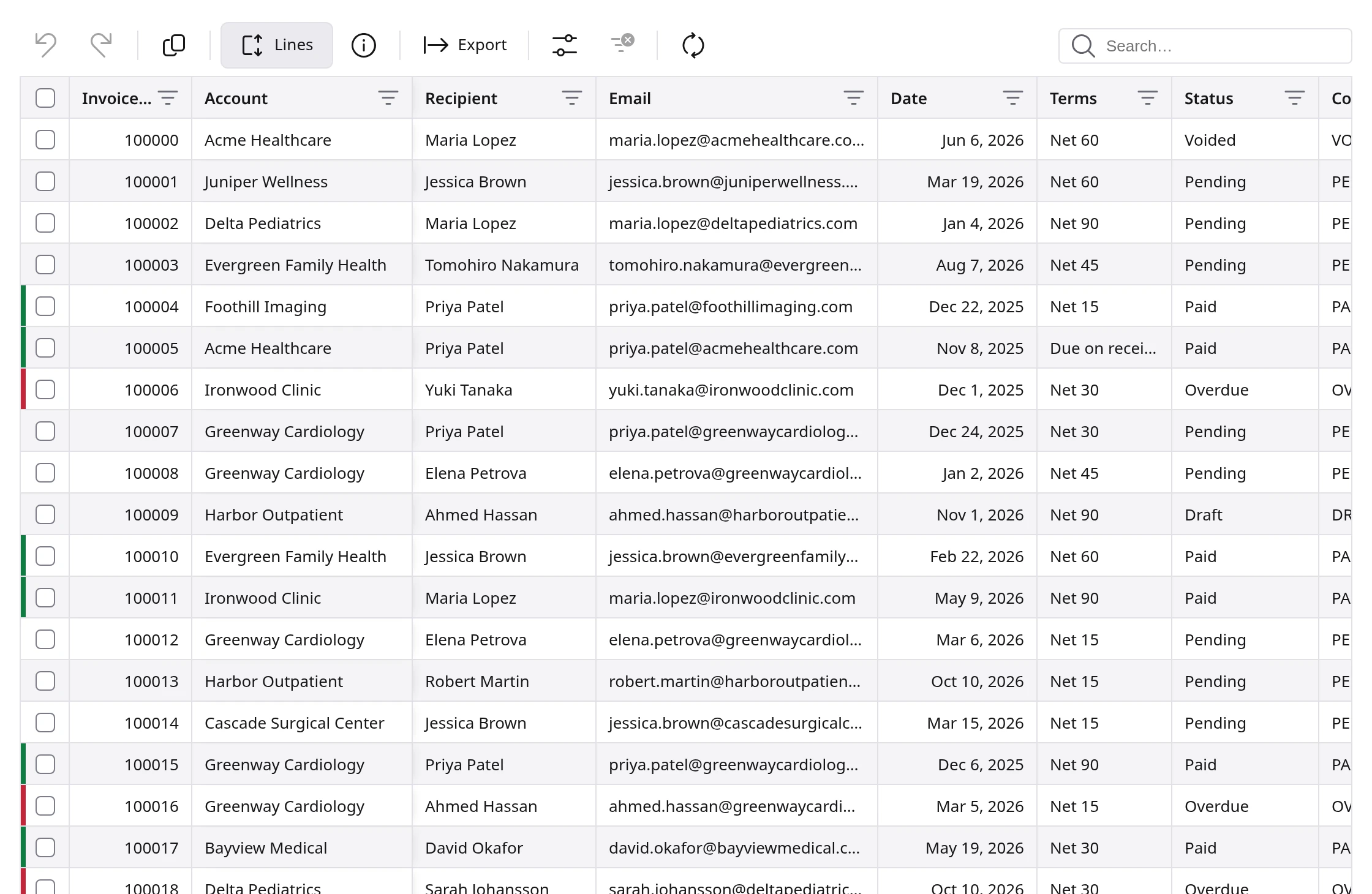
Most of the work in Flow Platform happens in lists: events, invoices, payments, translations. FlowGrid makes every one of those lists work the same way, so what you learn on one screen works on all of them:
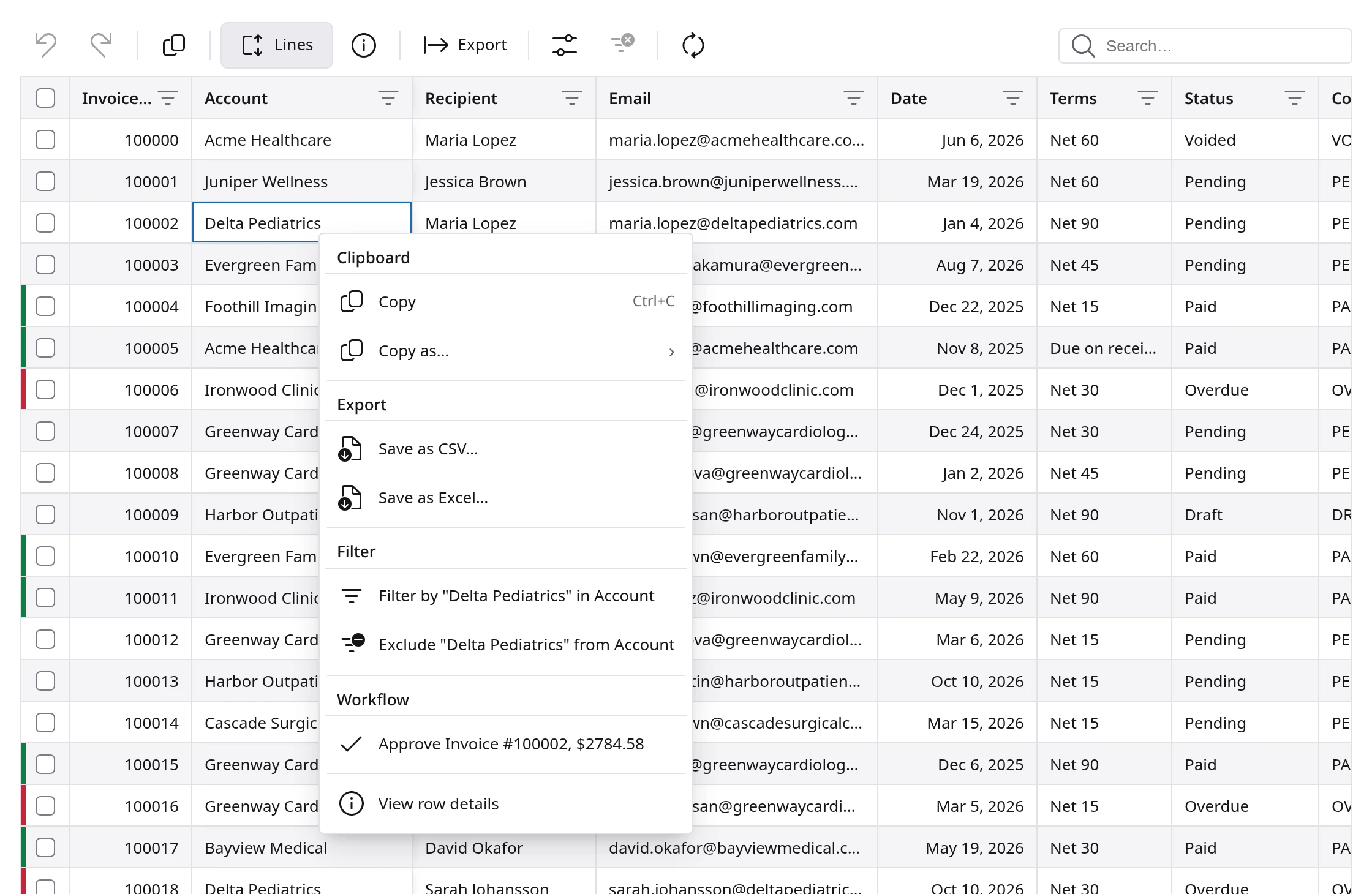
- Right-click to act. Copy a value, save the list as CSV or Excel, or filter by any value, or exclude it, straight from the cell you are looking at.
- Your layout, remembered. Reorder, resize, show, and hide columns with Manage columns, and the list opens the way you left it next time.
- Room to read. The Lines control lets long entries wrap to two, three, or four lines when you need the full text.
- Totals at the bottom. A footer shows the row count, how many rows are selected, and sums where they matter.
- Export that matches the screen. PDF and Excel exports follow the columns, dates, and formats you see.
The Advanced Dropdown: find anything, in any amount
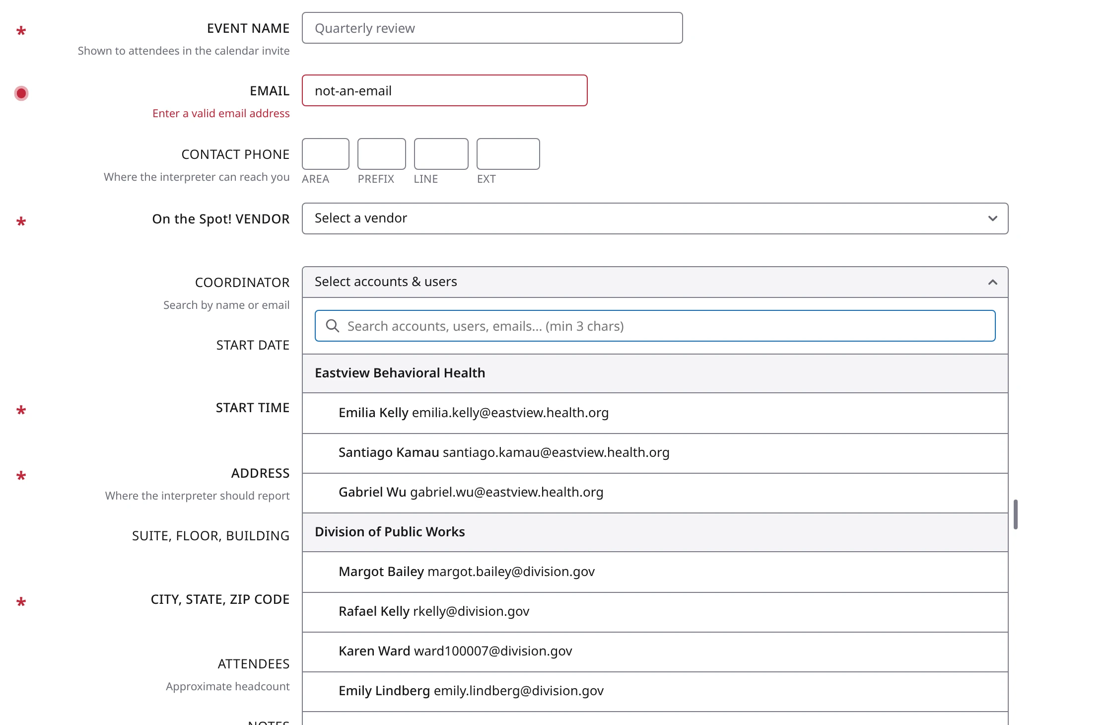
Picking an account used to mean scrolling a long list and hoping. The Advanced Dropdown turns selection into search:
- Type to find. Start typing and the list narrows instantly, matching names, emails, and ID numbers, even across a million accounts.
- Your account structure, as it really is. Main accounts and their sub-accounts are shown as a tree, with each account's users beneath it.
- Exactly what you mean. Tick one account and you get that account. One click on the branch button selects the whole branch, the main account and every sub-account under it.
- Configurable to the job. The same dropdown can pick one item or many, accounts or users, and can show only what you have selected.
- Keyboard friendly. Search, move, and select without touching the mouse.
Notifications that keep you informed, never in the way
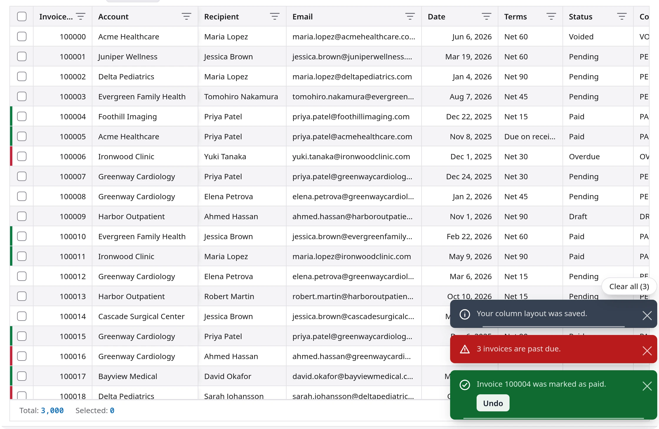
Every message the platform shows you, confirmations, warnings, errors, progress, now comes from one notification system that works the same everywhere:
- Messages stack neatly in the corner instead of covering your work, and gather into a compact pile you can expand with a hover.
- Undo where it counts. Some messages carry an action, like Undo, so a slip is one click away from being reversed.
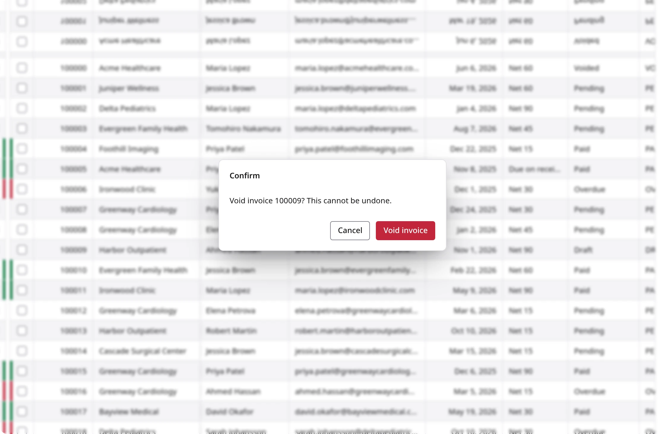
- Confirmations say exactly what will happen, with the risky choice clearly marked, before anything permanent is done.
Tooltips, menus, and forms that behave the same everywhere
Hover over an icon and a tooltip tells you what it does, in the same place and style on every screen, and it appears for keyboard users too. Right-click menus are organized the same way throughout the platform. Forms follow one layout, with required fields clearly marked and problems explained right beside the field, in plain words, as you type, rather than after you press Save. You can see both in the form shown above.
Coming next: the home-screen calendar
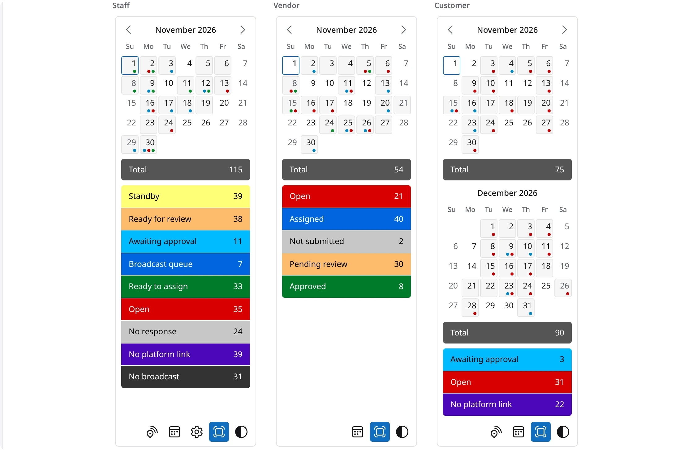
The next screen to move to Flow UI is the calendar on your home screen. It shows how Flow UI handles a busy picture: the month at a glance, color marks on each day, and totals and tiles that open the matching list with one click. It is designed to be just as clear for staff, interpreters, and customers, in light mode and dark mode alike.
Accessible by design
Accessibility was not added at the end. It is built into every Flow UI component, which means every screen built from them inherits it. Flow UI is designed to the WCAG 2.2 AA accessibility standard:
- Everything works from the keyboard, including ticking checkboxes inside tables, with a clearly visible focus ring wherever you are.
- Text and controls have enough contrast to read comfortably, in both light and dark mode.
- Screen readers announce controls, menus, and messages correctly.
- Color is never the only signal. Statuses carry words, not just colors.
For people who need even more, Flow UI includes an optional enhanced accessibility mode that goes beyond the standard: an even stronger focus outline, larger click targets, higher contrast, underlined links, and a skip-to-content link.
Because accessibility lives in the shared components, every screen that moves to Flow UI becomes accessible as it moves. Power Tools and Find Event have already been audited against WCAG 2.2 AA.
One family of components
Flow UI is a full family of building blocks designed to work together:
- FlowGrid for lists and tables of any size
- Advanced and classic dropdowns for searching and selecting
- Toolbars, tabs, and right-click menus for actions
- Notifications, banners, and dialogs for messages and confirmations
- Tooltips for explaining what a control does
- Calendars and date pickers, including the home-screen calendar
- Forms and fields, including phone numbers, attachments, and rich text
- PDF export and image cropping
- One icon set, drawn in a single consistent style
Every one of them supports light and dark mode, follows the same rules for keyboard use and contrast, and loads quickly from a content delivery network.
Where you will see it
Flow UI is live today in Power Tools, the rebuilt Receive Payment, and the lists in Find Event. The home-screen calendar is next, and more screens will follow. With each one, the platform gets faster, more consistent, and easier for everyone to use.
Questions about Flow UI or any of these screens? Visit our Help Desk and our team will be glad to assist.